
Microsoft continues to innovate in the NUI space, continuously providing new modalities for interacting with our computing systems. We are leveraging our expertise in NUI and developing a radically new way for people to more naturally access information that helps them not only explore their data but also present insights through simple interactive sketches. We aim to remove some of the interaction friction present in traditional desktop interfaces to enable people to more effectively explore, understand, and communicate data.
InChorus
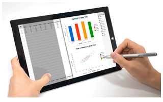
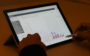 InChorus is a new multimodal interface that incorporates pen, touch, and speech to facilitate data exploration on tablet devices. To design multimodal interactions that function consistently across multiple visualizations, InChorus brings speech interaction into pen and touch interaction: the directness and precision of pen and touch is complemented by the freedom of expression afforded by speech. Each of the three input modalities can work individually for the operations that fit their inherent characteristics.
DataBreeze
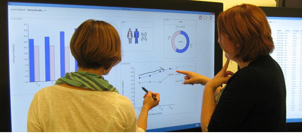
 DataBreeze is a multimodal system that facilitates visual data exploration by supporting constructing and interacting with flexible unit visualizations. Coupling pen, touch, and speech-based multimodal interaction with flexible unit visualizations, DataBreeze allows people to create and interact with both systematically bound (e.g., scatterplots, unit column charts) and manually customized views, enabling a novel visual data exploration experience.
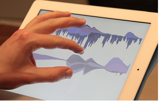
VoyagerInk
 Externalizing one’s thoughts can be helpful during data analysis, such as which one marks interesting data, notes hypotheses, and draws diagrams. We conducted two exploratory studies to investigate types and use of externalizations during the analysis process. We first studied how people take notes during different stages of data analysis using VoyagerNote, a visualization recommendation system augmented to support text annotations, and coupled with participants’ favorite external note-taking tools (e.g., word processor, pen & paper). Externalizations manifested mostly as notes written on paper or in a word processor, with annotations atop views used almost exclusively in the initial phase of analysis. In the second study, we investigated two specific opportunities: (1) integrating digital pen input to facilitate the use of free-form externalizations and (2) providing a more explicit linking between visualizations and externalizations. We conducted a study with VoyagerInk, a visualization system that enabled free-form externalization with a digital pen as well as touch interactions to link externalizations to data. Participants created more graphical externalizations with VoyagerInk and revisited over half of their externalizations via the linking mechanism.
Multimodal Interaction for Data Visualization (opens in new tab)
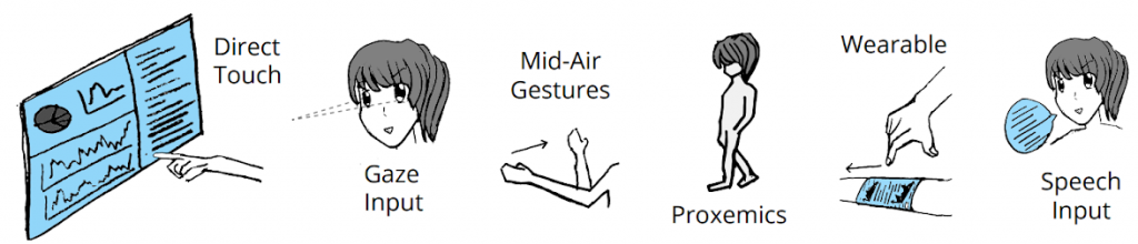
Multimodal interaction offers many potential benefits for data visualization. It can help people stay in the flow of their visual analysis and presentation, with the strengths of one interaction modality offsetting the weaknesses of others. Furthermore, multimodal interaction offers strong promise for leveraging data visualization on diverse display hardware including mobile, AR/VR, and large displays. However, prior research on visualization and interaction techniques has mostly explored a single input modality such as mouse, touch, pen, or more recently, natural language and speech. The unique challenges and opportunities of synergistic multimodal interaction for data visualization have yet to be investigated. With this workshop, we aim to build a community of researchers focusing on multimodal interaction, explore opportunities and challenges in our research, and establish an agenda for multimodal interaction research specifically for data visualization.
TouchPivot
TouchPivot is a novel interface that assists visual data exploration on tablet devices. With novices in mind, TouchPivot supports data transformations, such as pivoting and filtering, with simple pen and touch interactions, and facilitates understanding of the transformations through tight coupling between a data table and visualization. We bring in WIMP interfaces to TouchPivot, leveraging their familiarity and accessibility to novices.
SketchInsight
 We advance research efforts in combining the casual sketching approach of whiteboards with the machine’s computing power. SketchInsight is a system that applies the familiar and collaborative features of a whiteboard interface to the accurate data exploration capabilities of interactive visualizations. SketchInsight enables data analysis with more fluid interaction, allowing people to visually explore their data by drawing simple charts and directly manipulating them.
WordlePlus
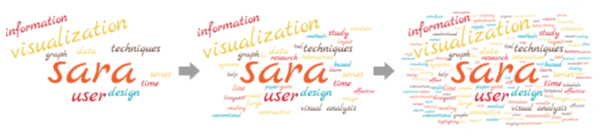 We open new possibilities of Wordle, a visualization technique commonly used to summarize texts. WordlePlus is an interactive authoring tool that leverages natural interaction and animation. It supports direct manipulation on words with pen and touch interaction, enabling more flexible wordle creation. WordlePlus introduces new two-word multi-touch manipulation, such as concatenating and grouping two words, and provides pen interaction for adding and deleting a word. In addition, WordlePlus employs animation to amplify the strength of Wordle, allowing people to create more dynamic and engaging wordles.
SketchStory
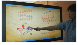 To create a new, more engaging form of storytelling with data, we leverage and extend the narrative storytelling attributes of whiteboard animation with pen and touch interactions. SketchStory is a data-enabled digital whiteboard that facilitates the creation of personalized and expressive data charts quickly and easily. SketchStory recognizes a small set of sketch gestures for chart invocation, and automatically completes charts by synthesizing the visuals from the presenter-provided example icon and binding them to the underlying data. Furthermore, SketchStory allows the presenter to move and size the completed data charts with touch, and filter the underlying data to facilitate interactive exploration.
TouchWave
 We bring multi-touch interactions to a specific visualization technique, stacked graphs. Stacked graphs are a visually appealing and popular method for presenting time series data, however, they come with associated problems—issues with legibility, difficulties with comparisons, and restrictions in scalability. TouchWave is a rethinking and extension of stacked graphs for multi-touch capable devices that provides a variety of flexible layout adjustments, interactive options for querying data values, and seamlessly switching between different visualizations. In addition to ameliorating the main issues of stacked graphs, TouchWave also integrates hierarchical data within stacked graphs. We demonstrate TouchWave capabilities with two datasets—a music listening history and movie box office revenues—and discuss the implications for weaning other visualizations off mouse and keyboard.
人员
Nathalie Henry Riche
Principal Researcher
Greg Smith
Principal Research Software Development Engineer