Problem
The user needs to understand what the system can do.
Solution
Provide a brief introduction to overall system capabilities and/or to a specific feature.
Use when
- The user is not familiar with the type of system or feature.
- It is desirable to help the user differentiate among similar systems or features.
How
Make the introduction brief: One sentence or less, consumable in less than 10 seconds.
Make the introduction clear and descriptive.
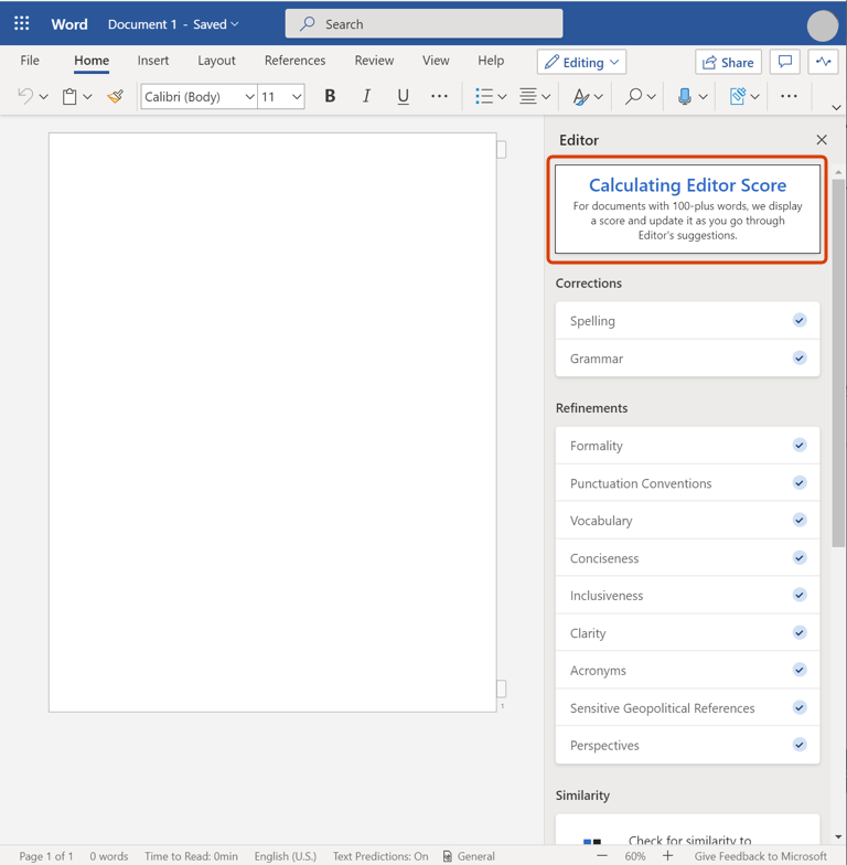
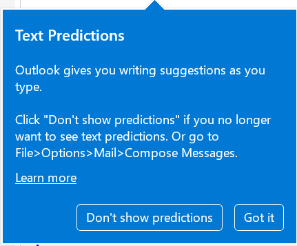
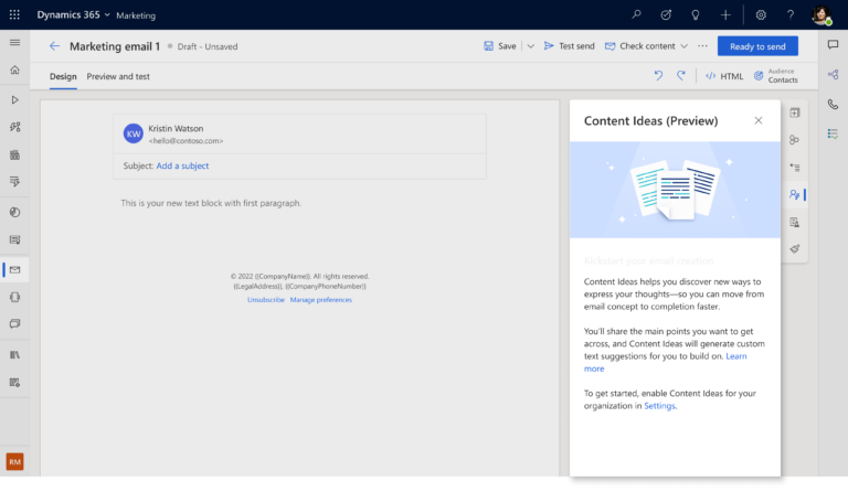
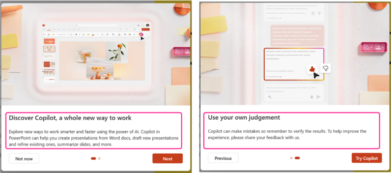
The introduction may be displayed:
- Next to the product or feature name in the actual product or an app store.
- In a user-input field.
- On the user’s initial interaction with a feature or product.
- At the beginning of each interaction with a feature or product.
- In a visible yet subtle manner.
Make the introduction easy to dismiss.
User benefits
- Helps the user to discover non-obvious system capabilities.
Common pitfalls
- The introduction portrays the AI system to be more capable than it is or mysterious and impossible to understand (e.g., “magic”).
- The introduction is catchy, but not descriptive of actual system capabilities.
- The introduction is in a hard-to-discover location.
- Repeated exposure to the introduction may frustrate the user.
- Certain UI displays may be subject to ad blindness.
- The pattern implementation creates expectations that the system can do more than it is capable.
Note: Over-inflated user expectations have been shown to cause frustration and even product abandonment.


