Wrapping text around figures, also known as graphic objects or images, can help give your documents a more polished look and help focus attention on the most important content. Last week, I wrote about the basics of inline vs. floating figures. One of the big differences between these types of images is that floating images are positioned separately from the text, allowing text to wrap around, over, and behind the images. Word has several wrapping styles that give you control over how the image integrates with the document. Today, I’ll explain the options and share my thoughts on when to use each one.
Wrapping text around figures, also called graphic objects or images, can give your documents a more polished look and help focus attention on the most important content. Last week, I wrote about the basics of inline vs. floating figures. One of the big differences between these types of images is that floating images are positioned separately from the text, allowing text to wrap around, over, and behind the image.
Word has several wrapping styles that give you control over how the image integrates with the document. Today, I’ll explain the options and share my thoughts on when to use each one.
Square wrapping
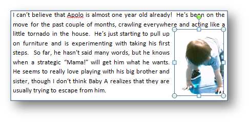
The most common wrapping style is Square, which means the text wraps around a rectangular box (called a “bounding box”) that encloses the image. You can see the bounding box when the image is selected. I like to use this option when I want the image very close to the text that describes it.
For example, in my holiday newsletter last year, I had a paragraph about each of my children, with a small picture included similar to this:
Tight wrapping
Tight wrapping is similar to square wrapping, but instead of following the line of the bounding box, it follows the shape of the image. If the image is a rectangle, you won’t see a difference. But if your image is any other shape, the text wraps closely around the edge, creating a more dramatic effect.
You can use this to focus the attention on the image, as in the example below. I used the same picture, but removed the background and switched to Tight text wrapping:
Through wrapping
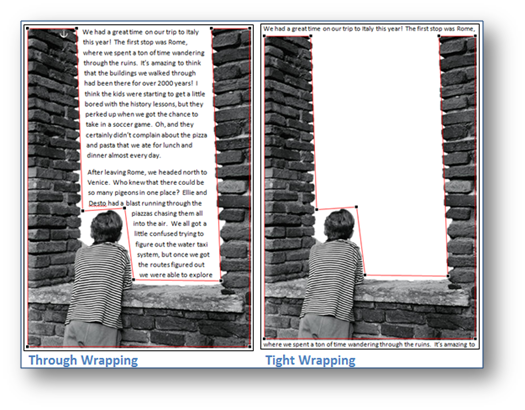
The least understood wrapping option is Through. When you initially apply it, it looks exactly like tight wrapping. The difference is that Through wrapping allows text to flow into the white space inside an image. It won’t do that by default, though. To see the full effect, you need to use the Edit Wrap Points option on the Wrap Text menu. Once you select this option, the line that the text follows when wrapping will be visible (the red line in the example below), with handles at each corner that can be dragged to adjust that line.
In the example below, I created an interesting page border by removing the background from the picture and then adjusting the wrap points to follow the inside of the walls. Notice how the text fills in the area of the picture only when Through wrapping is selected:
Top and Bottom wrapping
Sometimes you want an image to be on a line by itself. You can use In Line with Text, but as I explained last week, you lose some flexibility in how it is positioned. Instead, try using Top and Bottom wrapping. As the name implies, the text will stay above and below the image, not wrapping on the sides. This can be useful when you have a large image that doesn’t leave much room for wrapping text on the sides. All the images in this post use this style of wrapping.
Behind Text and In Front of Text
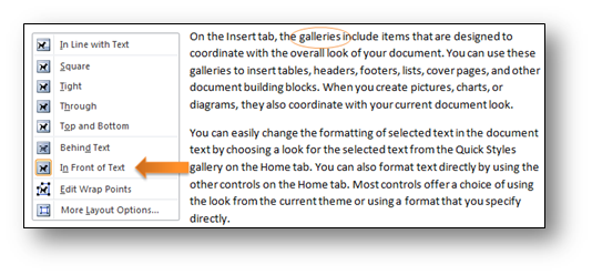
The last two wrapping styles don’t actually cause the text to wrap around the image. Instead, they place the image on a separate layer from the text. The Behind Text option causes the text to flow over the image. This can be useful if you want to create a watermark effect or a background to a section of the page.
The In Front of Text option lets the image sit on top of the text. I use this effect regularly as I write technical specifications, adding arrows that call attention to specific areas of other images or to circle important text:

Next week, we’ll look at how floating images are attached to the document and what that attachment means when you need to control an image’s position.
— Theresa Estrada is a program manager on the Word team who spends most of her days (and some nights) studying how users work with images in their documents.


