Bojana Duke is a Program Manager on the SharePoint team. She’s been working on the sharing features along with the callout, performance and legacy features.
We know that people often use SharePoint sites for mission-critical information and processes. So it’s extremely important that upgrades to our product and service are as quick and painless as possible. When you upgrade a site from SharePoint 2010 to SharePoint 2013, we go to great lengths to ensure that the content and structure of your site are preserved. But, there’s a tradeoff here. Because we don’t want to interfere with the way you’ve customized your site, some new features won’t be enabled by default on your upgraded site. This post tells you about these features, and how you can enable them.
Your site, before and after upgrade
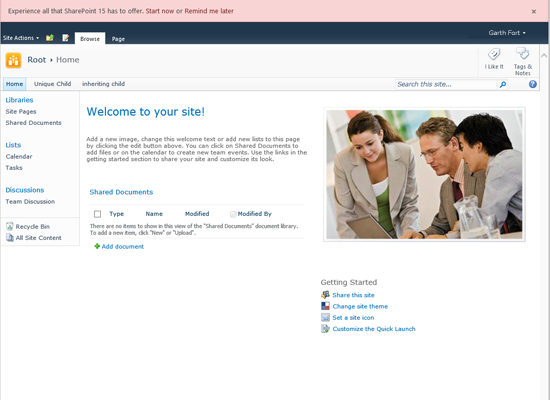
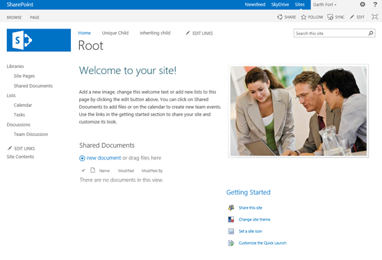
Before we dig into the features that are NOT present by default, let’s look at all the differences we can see on an example site before and after upgrade:


The most obvious change after upgrade is the new default master page. It’s simple and clean, designed to help showcase the contents of your site. The new master page includes the styles used to format text in your site, so you’ll see that fonts, colors, and text sizes may have changed.
Most of the main components of the site are still there, and still in the same places; they just look a little different.
In SharePoint 2010, the site logo was constrained to a small 60 x 60 pixel square. In SharePoint 2013, the optimal size for your site logo (assuming you use the default master page) is 180 x 64 pixels. You may want to upload a new logo graphic that helps you take advantage of the new space.
SharePoint 2010 introduced the ribbon as a central place to find commands for interacting with SharePoint. The ribbon still plays a major role in SharePoint 2013, but we’ve minimized it by default, to help people focus on the contents of their sites. Simply choose a ribbon tab (for example, click “PAGE in the upper-left corner)” to open the ribbon.
The blue (by default) global navigation bar now appears on every page of every site in SharePoint, to help people find their way around.
Site Actions menu
The menu known as “Site Actions” in SharePoint 2010 has moved to the top-right corner of the screen. It’s represented by the “gear” icon and now referred to simply as “Settings.” This menu is consistent with other products in the Office suite, like Outlook Web App.
Promoted actions
In SharePoint 2010, there were a few “Quick Action” icons in the upper-left corner of the screen, wedged in between the Site Actions menu and the ribbon. In SharePoint 2013, we’ve expanded this set of icons, and moved it to the right side of the page.
Edit Links command
You’ll also notice a new EDIT LINKS command available at the end of the Quick Launch and Top Navigation menus. Use this command to enter a quick editing mode for organizing your site’s navigation.
Differences between upgraded sites and fresh sites
If you create a fresh team site in SharePoint 2013, you’ll notice several pretty obvious differences between it and your upgraded site.
Getting Started tiles
Perhaps the most obvious difference is the presence of “Getting Started tiles” on newly created team sites in SharePoint 2013.

The tiles provide shortcuts to several common actions, like sharing your site and applying a theme. The tiles replace the “Getting Started” links from SharePoint 2010.
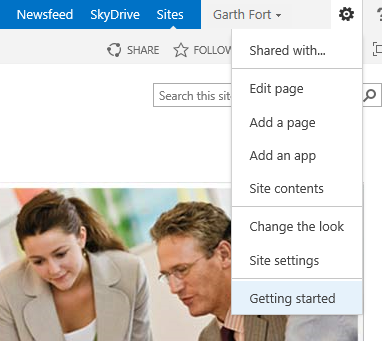
The tiles are automatically added to your upgraded site, but aren’t added to your home page because we don’t want to interfere with your content. You can access the tiles from the Settings menu by choosing Getting started.

Of course, you can also edit your home page to remove the old Getting Started links and add the tiles. To completely mimic the SharePoint 2013 home page, you’ll have to make a few changes:
-
Change the page layoutEdit the home page, and then, on the Format Text tab of the ribbon, choose Text Layout. Then, choose Two columns with header.
 Figure 5. Using the ribbon to change the page layout
 -
Add the tilesPosition the text cursor in the header text area and then, from the INSERT tab of the ribbon, insert the Get started with your site web part.
 Figure 6. Inserting the Get Started with Your Site web part, to add the new Getting Started tiles
 -
Delete old contentIf you want, you can remove old or unnecessary content from the two columns of the page.
 Figure 7. Optionally deleting old content
 - Move shared documents
In SharePoint 2013, a site newsfeed goes in the left column of the home page. We’ll discuss how to add that later. For now, drag the Shared Documents web part from the left to the right column. - Save the page and stop editing
Site Notebook feature
Team Sites in SharePoint 2013 come with a OneNote notebook. To add this notebook to an upgraded site, simply activate the Site Notebook feature. (Note that this feature requires an associated WAC server.)
To activate Site Notebook:
- Settings (gear) -> Site settings -> Manage site features
From the Settings menu, choose Site settings, and then choose Manage site features. -
Activate Site NotebookFor Site Notebook, choose Activate.
 Figure 8. The Site Notebook feature
Site Newsfeed feature
Sites come with a site newsfeed in SharePoint 2013. There are a few prerequisites before you can add a feed to your upgraded site:
- Requires SharePoint Server
- My Site Host must be deployed
- The site must be on the same web application as the My Site Host
To add a site newsfeed:
- Settings (gear) -> Site settings -> Manage Site Features
From the Settings menu, choose Site settings, and then choose Manage site features. - Activate the “Site Feed” feature
For Site Newsfeed, choose Activate. - Add the Site Feed web part to the home page
Position the text cursor in the header text area and then, from the INSERT tab of the ribbon, insert the Site Feed web part.
Navigation structure
As I mentioned earlier, our philosophy in SharePoint 2013 is to focus on the contents of sites rather than the tools and structure of SharePoint. You can see this philosophy manifested in our decision to remove headings (like Libraries and Lists and Discussions) from the navigation menu.
You can easily update your site’s navigation menu to match our new convention by removing headings:
- In the navigation menu, choose EDIT LINKS.
- Drag items out from under their headings.
- Delete unnecessary headings.
In new SharePoint sites, we also try to avoid cluttering the site navigation with every list, library, app, or page that lives in the site. We encourage you to carefully curate the navigation menu, and delete items that are not commonly used.
And then we have several changes that aren’t as obvious as the ones outlined above, but will still make a difference in your SharePoint experience.
Pages vs. dialogs for forms
With SharePoint 2013 and some of the great performance work we’ve done, we have a much smoother transition between pages. We have chosen to open List and Library forms by default in a full page, instead of in a dialog box. This helps you focus on the content of the form without being distracted by the background, and provides more space for you to see the information you’re working on.
To enable your forms to open in a full page, you can change the List or Library settings:
-
- On the List or Library tab on the ribbon, choose List Settings or Library Settings.
-
- In the first column, choose Advanced Settings.
-
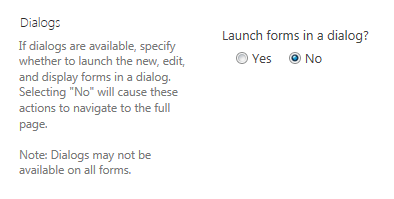
- Scroll to the bottom, to see the Dialogs option:

- Select No, and then choose OK to save this setting.
Default permissions
We wanted to make SharePoint even more open to all users, so our new default permission level, Edit, includes the ability to create and manage lists and libraries. For existing sites, you’ll have to change the permissions level of the Members group to be Edit:
-
- On the Settings menu (the gear), choose Shared with.
- Choose Advanced.
-
- Select the check box next to the Members group for your site.
-
- In the ribbon, choose Edit User Permissions.
- Select the Edit option, and then choose OK.
Existing users in the Members group will now have these new permissions, and all new users added to the Members group will get these capabilities automatically.
Sharing with everyone
To help users understand how to share broadly without having to worry about managing complex permissions, we renamed the “All authenticated users” and “All tenant users” claims to more friendly terms: “Everyone” and “Everyone excluding external users.” This enables users to search for these claims in the people picker simply by typing “everyone.”
How upgraded users get these strings
“All authenticated users” is now called “Everyone” and “All tenant users” is now called “Everyone excluding external users,” but these changes are not updated automatically during upgrade. To receive these changes, you have to activate (via Windows PowerShell) the feature with the following GUID: 10F73B29-5779-46b3-85A8-4817A6E9A6C2
$siteUrl = “http://www.contoso.com/” #URL of site collection
$site = Get-SPSite $siteUrl $site.Features.Add([System.Guid]”10F73B29-5779-46b3-85A8-4817A6E9A6C2″)
Everyone vs. Everyone excluding external users
In SharePoint on-premises deployments, the “Everyone” claim is the new name for what was formerly known as “All authenticated users.” SharePoint Online includes this “Everyone” claim, which will include external users if the feature is enabled (because external users are also “authenticated users”). SharePoint Online also includes a second claim “Everyone excluding external users,” which maps to the former “All tenant users” claim and includes all authenticated users except external users.
Turning on Minimal Download Strategy (MDS)
MDS helps pages to perform faster and more smoothly by downloading only content that has changed as you move from page to page.
Because MDS is not compatible with all SharePoint customizations, we’ve left it off by default. You can decide whether to turn it on after upgrading. If you do not have any customizations, you can safely turn on MDS in Site Features:
- On the Settings menu (the gear), choose Site Settings, and then choose Manage site features.
- For Minimal Download Strategy, choose Activate.
If you do have customizations, you should consult forthcoming detailed guidance documentation to make sure your customizations are compatible with MDS. Customizations include third-party Web Parts, customized themes or master pages, and having the Publishing feature turned on.
We hope this lets you take full advantage of all the new features we’ve put together for SharePoint 2013. We’re excited about what we’ve built and are looking forward to hearing from you about how you’re using it!

