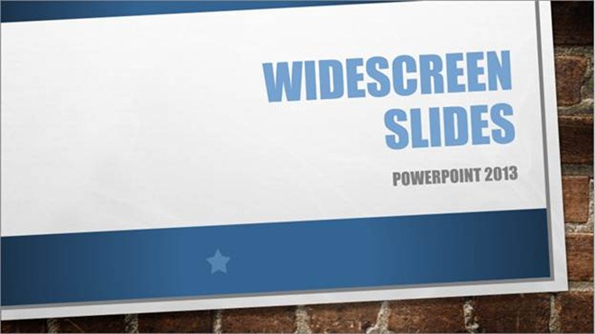
Widescreen (16:9) is the new default aspect ratio in the new PowerPoint. To make your experience with the new dimensions pleasant, we’ve built a brand new set of themes specifically targeting this aspect ratio, and we’ve improved our conversion code so that you can easily make the switch to widescreen from other aspect ratios.
The cinematic format
The rise of high definition (HD) brings the widescreen aspect ratio of 16:9 to televisions, computer screens, and projectors in homes and workplaces all around the globe. And yet, there are bazillions of PowerPoint slides crafted in the relatively square, 4:3 shape. There is some logic to this: Many devices are still square shaped, such as classic projectors and monitors, certain touch computers – I’m sure there’s even an old phone somewhere out there. Widescreen, however, is skyrocketing. It’s finding its way onto most laptops and desktops, many modern projectors, nearly every TV on the planet, and, most recently, our own beautiful Surface device. Now, it’s taking over PowerPoint, too:
Widescreen, also known as 16:9, HDTV, 720p, 1080p, 13.333”x7.5”, among other names, is the new default aspect ratio in the new PowerPoint. To make your experience with the new dimensions pleasant, we’ve built a brand new set of themes specifically targeting this aspect ratio, and we’ve improved our conversion code so that you can easily make the switch to widescreen from other aspect ratios.
Widescreen is amazing for presentations
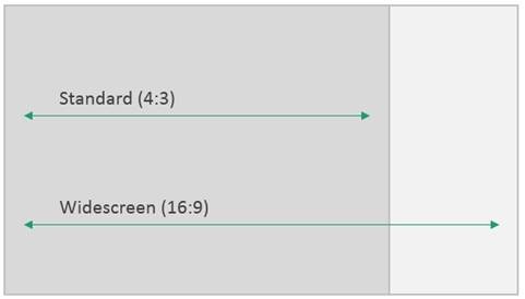
PowerPoint and widescreen were made for each other. Let’s take a quick look at the old standard (4:3) aspect ratio compared to the new widescreen (16:9) aspect ratio:
In the widescreen shape, there’s lots of horizontal space. The moment you start building a presentation in widescreen, you’ll start to notice some very cool things about the format. In widescreen there’s space for all kinds of content, pictures, and even design elements – content that flows naturally across the slides:
What should I do with all my old presentations?
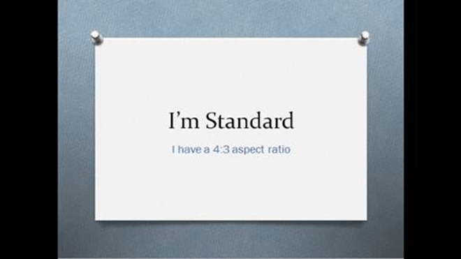
It’s perfectly fine to have a presentation in the 4:3 format. If you present on a widescreen TV or projector, PowerPoint fills in the extra space with black bars on the left and right of the screen, so the projection space appears smaller:
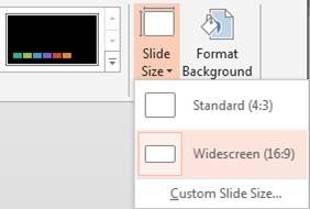
If you want to make use of the extra space, switching between aspect ratios works better than ever in the new PowerPoint. Simply go to the Design tab and click the Slide Size drop down:
On the dropdown menu, select Widescreen, and you’re on your way. All new PowerPoint themes have designs that are specifically crafted for both 4:3 and 16:9 which are automatically applied when you change slide size. This lets you switch between aspect ratios without stretching the background and design elements, and it prevents you from running into annoying layout issues:
When it comes to scaling your content from 4:3 to 16:9, each object’s dimensions stay proportional, and related items stay together so that your message retains as much of its original meaning and beauty as possible:
Working with classic (4:3) projectors
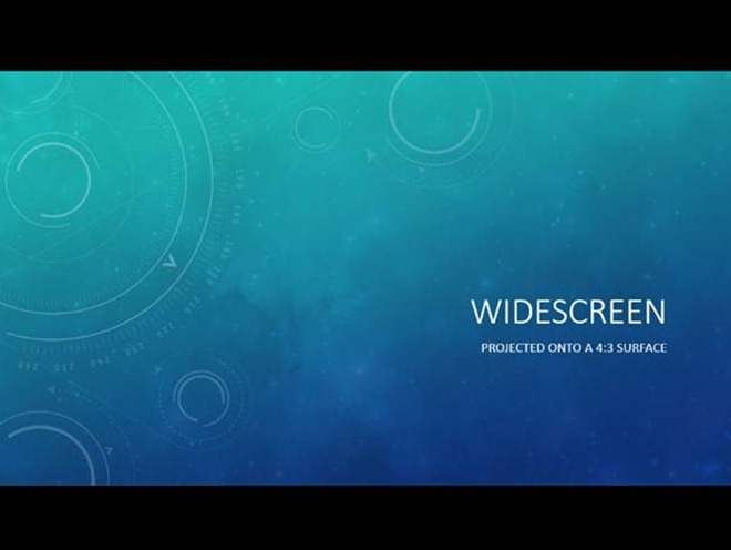
If you’re working with a widescreen presentation and you encounter a 4:3 projector, you have a couple of options. One option is to simply start your slideshow, and PowerPoint will letterbox your presentation – that is, PowerPoint will add black bars to the top and bottom of your slides. With letterboxing, you end up with something like this:
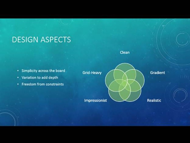
You might think, “It’s not really using all the space.” You might even try converting from widescreen to standard, which is your second option, and if you are using a PowerPoint 2013 or higher theme, you’ll get a premium experience. However, we on the PowerPoint team have found the widescreen format so much better in terms of layout that we find it hard to switch to 4:3. Just look at how well the content is balanced in the 16:9 slide below. It naturally forms regions of interest right around the areas where it makes sense to place content:
Yes, you are sacrificing some space on the square projector, but you’ll also be able to use that available space more creatively and strategically, thanks to inherent layout advantages of the widescreen aspect ratio. Also, your presentation will shine on modern devices like HDTVs, tablets, and newer projectors, where the screen’s aspect ratio matches your presentation.
Working with print
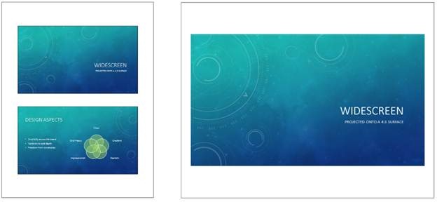
Many common paper sizes are relatively close to 4:3. In fact, when you subtract the commonly-used one-inch margin from North America’s standard letter size paper (8.5”x11”), you end up with a printable area that is exactly 4:3 (7.5”x10”). Standard (4:3) slides fill the space perfectly. The same is almost true of the international standard A4 paper. However, having some extra empty space at the top and bottom can be nice if you’re taking notes, as is the case when printing widescreen slides onto these paper dimensions. Interestingly, we’ve found that when you print two widescreen slides per page, they fit quite perfectly (unlike standard slides), so you can print twice as much info on a single page, and you can save that many more trees, along with whatever it is that makes ink:
Setting your default aspect ratio
If you open a work template or a pre-existing file, we will of course honor the aspect ratio specified in the file. If you’re making a lot of new files and you need to continue working with 4:3 or any other aspect ratio, here’s how you set the default for a new presentation:
- Convert a blank presentation to 4:3 (or to a custom aspect ratio)
- Save the theme by clicking on the Design tab, then on the main gallery drop-down, and then on the “Save Current Theme…“ button
- Your saved theme will appear in the main gallery if you save it to the default folder. Right-click the theme in the main gallery and choose “Set as Default Theme”
We hope you enjoy this wonderful world of widescreen. Here’s to better presentations all around the world!
-Christopher Maloney
Program Manager, PowerPoint

