This post is brought to you by Alex Mullans, a Program Manager on the Office Graphics & Visualizations team.
Charts are a method for visual storytelling. You may not judge a story by its cover, but a great cover (or chart) will absolutely draw in more readers to engage with the rest of your content. So, we’ve built lots of options into Office charts to help you craft a visually appealing chart. There’s an option for everyone and (we hope) every scenario, no matter how much or little customization you’d like to do.
Themes and Chart Colors are great choices for quick-and-easy customization: just a couple clicks and you’re done. Likewise, Chart Styles can give your chart a whole new look with just one click. And, when those options don’t have what you’re looking for – or you just want to take matters into your own hands – the charts Task Pane has tons of options just waiting to be explored. You can create great charts using any of these methods; in this article, I’ll use a little of all of them.
Getting started with a combo chart
I’m writing this post from a flight that was delayed, so the story I’d like to tell is about the best flight choices from Detroit to Seattle, based on average delays, maximum delays, and historical on-time performance. To do that, I created the combo chart below. To comply with chart best practices, I made the following changes to the default chart I got from the Recommended Charts screen.
- I edited the Chart Title by triple-clicking on it.
- I added Axis Titles to all axes by clicking the Chart Elements button (the + symbol) and checking the Axis Titles box.
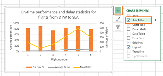
As it stands, this is a perfectly workable chart. It’s clean and readable, and it conveys a good amount of information. But it’s not quite the chart I’m looking for.
Using Chart Colors
Specifically, that orange is a bit bright for my taste. To change it:
- Select the chart by clicking on it.
- On the Ribbon, click the Chart Tools Design tab, then click the Change Colors button.
- Click a set of Chart Colors.
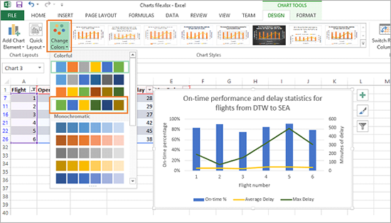
With just a few clicks, I’ve toned it down a bit. Note that this button only affected the chart I selected; the colors in the rest of my workbook are just as they were before.
Using Theme Colors
Now, if none of the colors in the Change Colors button catches your eye, changing your Excel workbook’s theme will give you even more color choices. To do so:
- Select the chart by clicking on it.
- On the Ribbon, click the Page Layout tab, then click the Colors button.
- Click a set of Theme Colors.
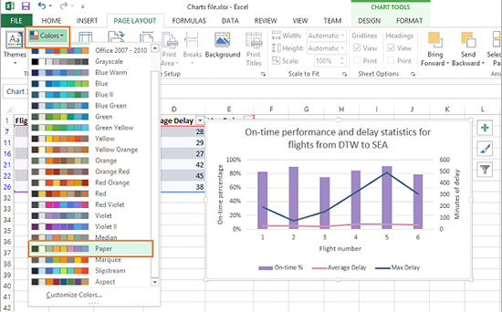
Do keep in mind that changing the Theme Colors affects your entire workbook (including other charts and theme-dependent objects like SmartArt).
Using Chart Styles
Chart Styles are a great way to go a little beyond just changing the colors of your chart – they affect more of your chart than the Chart Colors button does, but they’re still one-click easy. One of my favorites is the dark style, especially if you’re going to use your chart in a PowerPoint presentation with a dark background. To apply a Chart Style:
- Select the chart by clicking on it.
- On the Ribbon, click the Chart Tools Design tab, then click a Chart Style from the gallery.

Something to remember: Chart Colors and Theme Colors both impact Chart Styles – each Chart Style will change based on your selected Theme and Color set.
Using the Task Pane to customize your chart
It’s entirely possible never to use the Task Pane. For some charts, Chart Colors, Theme Colors, and Chart Styles will take care of the stylistic changes needed. But for charts that need more customization, the Task Pane is the place to look.
You might have noticed that the dark chart in the previous section had several changes: the lines became thicker, they acquired shadows, and the background became a radial black/grey gradient. Those changes are just some of the customizations that you can make in the Task Pane. Anything from the pattern of your lines and bars (e.g., dashed or shaded) to the content of your data labels can be changed in the Task Pane.
To open the Task Pane, just double-click on any chart element such as a series or the title. In this case, I double-clicked on the blue Max Delay line.
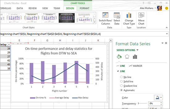
You also can choose an element and open the Task Pane from the Ribbon. To do so:
- Select the chart by clicking on it.
- On the Ribbon, click the Chart Tools Format tab, then use the dropdown menu to select an element.
- Click Format Selection.


Changing individual colors
To start out, I’m going to change the color of my max delay series. Visually, this adds contrast and highlights the series. In addition, changing the color adds a semantic meaning – delays in the US are generally shown in red–that helps my chart tell its story. To do that, I can:
- Click the Fill & Line tab (the paint bucket).
- Click the Line sub-heading.
- Click the Color paint bucket to select a red color for the line.

Adding and styling data labels
Next, I’d like to call out that high point on the Max Delay series, because the potential for almost 500 minutes of delay is something I’d like to avoid! To do so, I:
- Select the Max Delay series by clicking on it.
- Add Data Labels by clicking the Chart Elements button (the + symbol), checking the Data Labels box, and using the flyout menu to switch to Data Callouts.

There’s a bit more information in the callouts than I need. I’d like to remove the flight number, because that information is already clear from the horizontal axis; all I want is the length of the delay. To achieve this, I can:
- Select the data labels by clicking on one.
- In the Task Pane, click the Label Options tab (the bar chart icon).
- Click the Label Options subheading to expand it.
- Uncheck the Category Name box.

Then, to delete some individual data labels until only the high and low point labels are left, I can:
- Select all data labels by clicking on one.
- Select an individual label by clicking on it after all data labels are already selected.
- Delete the selected label by pressing the Delete key or right-clicking and choosing Delete.

Additional effects
My chart is almost telling the story I want it to tell. For some last effects, I’d like to thin the columns and thicken the Max Delay series line. To thin the columns, I can:
- Select the On-time % series by clicking on one of the bars.
- In the Task Pane, click the Series Options tab (the bar chart icon).
- Change the Gap Width to 410% by typing or using the slider.

To thicken the Max Delay series line, I can:
- Select the Max Delay series by clicking on it.
- In the Task Pane, click the Fill & Line tab (the paint bucket icon).
- Select a Width of 4 pt by typing or using the arrows.
- Select a Join type of Miter (which gives each bend the more angular appearance) by using the dropdown menu.

Manual element positioning
For one final tweak, I’d like to move the data label callouts so they don’t overlap my series. To achieve this, I can:
- Select all data labels by clicking on one.
- Select an individual label by clicking on it after all data labels are already selected.
- Click-and-drag the labels to a better position.
The final chart
Now that all the changes have been made, here’s my chart. Compared to my original chart, it tells a better, more visually appealing story; and, it helps me make a decision: Flight 5, while it’s frequently on time, has higher-than-average delays and a poor max delay record, so Flight 2 would probably be a better choice.

We’ve designed charts to give you the freedom to do pretty much whatever you’d like in terms of style. The Chart Styles option is great (especially combined with Theme and Chart Colors), because you’ll almost always end up with something clean-looking and usable, no matter which style you pick. On the other hand, you can do everything yourself with the Task Pane and have ultimate control over your chart. It’s worth noting that combining a lot of Task Pane changes can lead to a visually busy chart; but, used judiciously, you can create a pretty cool chart!
–Alex Mullans, Program Manager, Office Graphics & Visualizations team


