Sway just passed its one-year mark, and we are very inspired to see millions of users from all over the globe using Sway in their work and personal lives. We hope to serve even more people by delivering on our promise to make it effortless to create and share content with colleagues, family and friends.
Remix
First, let’s begin with our new Portfolio template as a sample Sway. Sway templates start you off with a color palette, layout and sample content. If you like the first combination you see, you can move on to the other tips below. But if you were looking for something different, click the Remix button on the top navigation bar and Sway will give you various combinations to select.
Here is a sample of different combinations you can get by pressing the Remix button a few times:

As you can see, the color scheme, font and layout all dynamically change and the differences become more apparent when you scroll through the Sways. The idea here is similar to having a designer by your side who whips up various styles options without you having to do a lot of work on your part.
Design
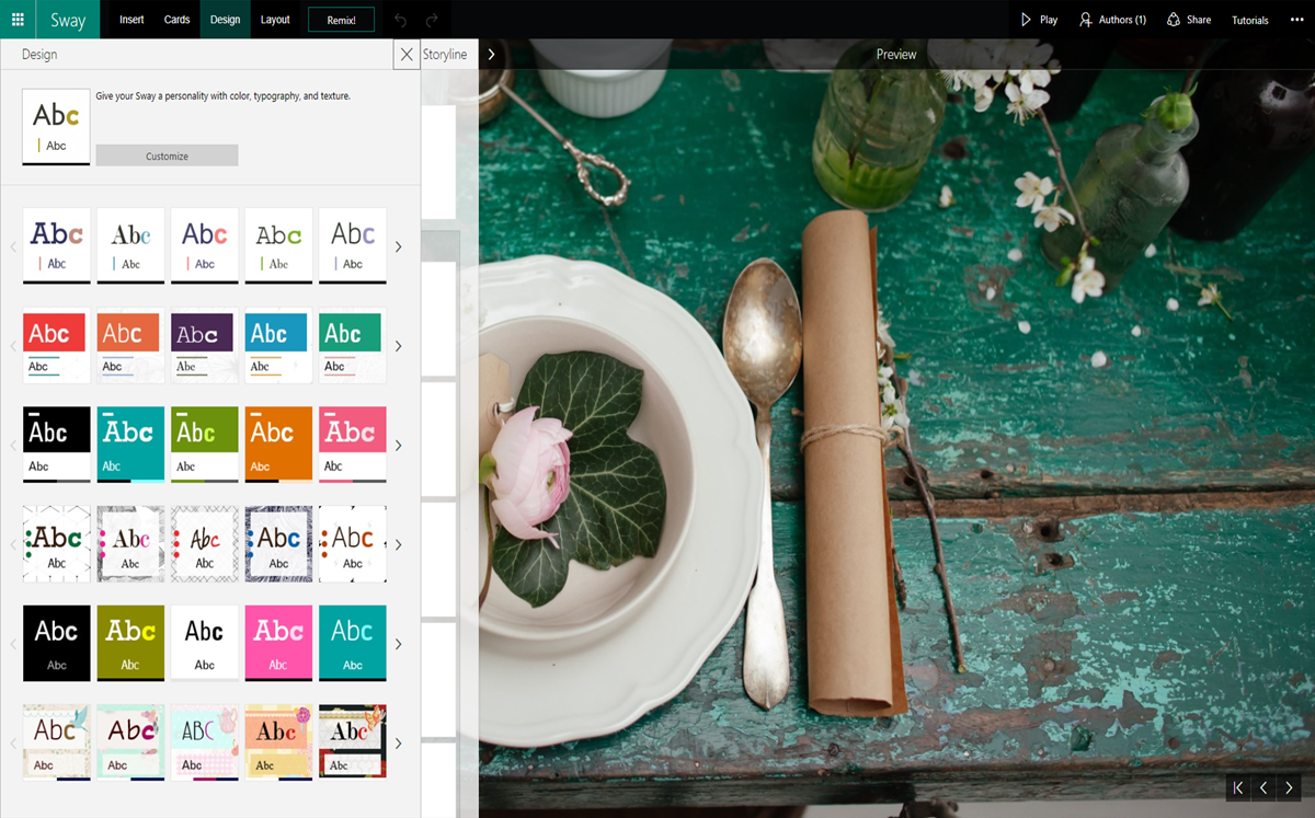
If you want to be more deliberate in the way you change your Sway’s style, you can also click the Design button on the top navigation bar. This opens up a Design pane that shows you a preview of the various style combinations you can select. Styles in the same row differ in small ways, like font and background, while styles in different rows change more substantially, such as in layout and structure.

Customize (in Design)
Once you find a style that works for you, the Customize button in the Design pane offers you the ability to fine-tune specific elements in your Sway. For instance, you can change just the color palette—keeping the rest of the Sway format intact. You can also customize font styles, font size and degree of animation.

Layout
The last major style element you can modify is your Sway’s layout. The Portfolio template we started from employs a Vertical layout, where the document moves from top to bottom, much like how most web pages work today.

You can easily switch the way your Sway flows. Simply select Layout on the top navigation bar and then select either vertically scrolling layout (top icon), horizontally scrolling layout (middle icon) or screen-by-screen, optimized for presentation layout (bottom icon).
Here is how the same Sway looks in Horizontal layout:

As with all the other functions, Sway makes it easy for you to change your Layout in just a few clicks. The app does all the work of reformatting everything else—so you won’t need to spend hours moving around your sections, text boxes, images and other content.
Undo/Redo and Duplicate
As you work on getting to your ideal Sway, don’t forget to use the Undo and Redo buttons on the top navigation bar in case you change your mind about some style changes. And if you want to use a particular style for all your Sways, you can use the Duplicate this Sway function in the … section to create a copy for future use.
Photo tips
As a bonus, these last few tips are easy ways to make sure your photos show up great. First, you can set how Sway displays your photo by clicking on the image or image card, selecting Focus Points and then selecting the parts that are most important to you.

You can mark specific areas in the photo that you want Sway to highlight or select The entire image is important checkbox. Sway automatically adjusts how your photo shows up and emphasizes certain areas based on your selection.
Second, you can select different sizes for your photos by clicking the image card and then selecting either Subtle, Moderate or Intense. Subtle will use the smallest image size, Moderate the medium image size and Intense the largest image size that will still look good with the rest of your Sway.

Lastly, you can Group your text, photos and other Sway cards when you want them to show up together in specific ways. In the example below, we first picked the photos we wanted to group together by selecting the checkboxes at the lower right of the cards. Next, we clicked the Group button, which opened up the Group Type pane, and selected the second Slideshow from the pane. The Sway preview shows you how the photos are instantly grouped together in a left-to-right Slideshow, with a preview bar at the bottom.

New Sway templates
We recently released several new templates to help you get started on your Sway. They’re currently available on the My Sways page in the Sway web app. Some of our favorites are featured on our new Land your dream job site. We partnered with careers expert Maxie McCoy to create a free resume, portfolio and blog post templates to help aspiring job hunters, artists and writers land their dream jobs—or simply have another great way to showcase their work.
We hope you find our tips useful and have learned a bit more on how to make the most of your Sway.
—The Sway team

