Every business decision starts with insights backed by data. However, trying to spot trends while staring at rows and columns of data isn’t exactly the most efficient way to get insights. Manually exporting data, creating charts and adjusting filters can be time-consuming and frustrating, creating spreadsheet fatigue. What if you could skip all this busy work and get straight to insights? We’re introducing Visualize with Copilot, a new capability that instantly transforms your business data into a meaningful interactive chart. Whether you’re tracking sales or driving customer service excellence or managing inventory, Visualize with Copilot can help you see the bigger picture instantly.
Introducing Visualize with Copilot
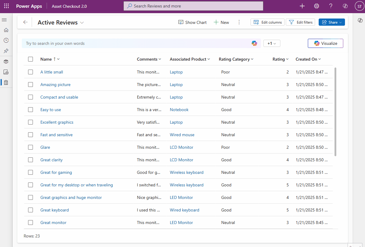
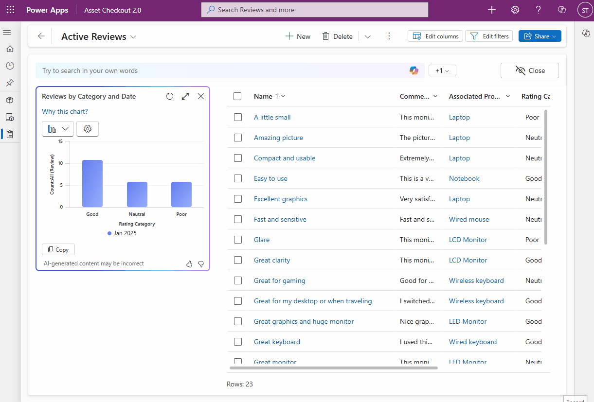
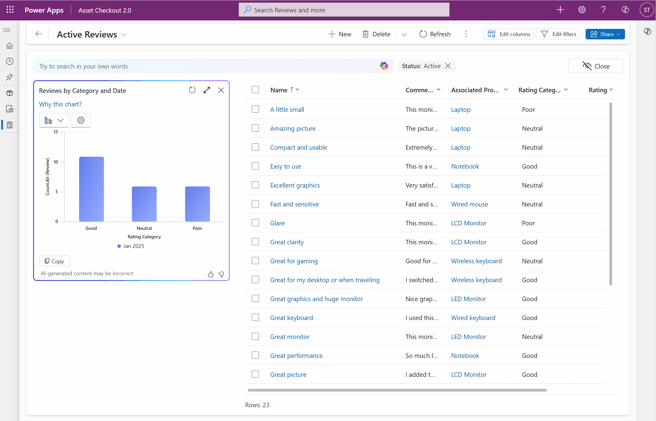
Data exploration is a task that can involve manual steps like exporting data to a spreadsheet, creating reports, and fiddling with filters. But, with Power Apps’ data exploration agent, you can now visualize your view as a chart to spot trends, patterns and relations your data with just one click. Every visualization comes with an AI-generated title and clear reasoning, giving you full context of the thought process.
Effortlessly refine AI-generated chart to fit your needs
The data exploration agent works for you – that’s why we’ve made it easier than ever to refine and personalize the AI-generated visualization with just a few clicks. You can change the chart type or adjust columns or modify aggregation to tailor the chart AI-generated according to your preferences.
Interact with visuals that stay in sync with your data
Data exploration is most powerful when the visualization is interactive, supporting drill downs. With the AI-generated visualization dynamically linked to the grid, you can interact with your data without any friction. Select a chart segment to filter the grid, refine your focus, and analyze data in real time. Together with natural language filtering, just type what you need, and watch as the data exploration agent filters your grid and updates your chart turning raw data into meaningful insights.
Use Visualize with Copilot in your model-driven apps by updating the following two feature settings in Power Platform Admin Center.
- Under Natural language grid and view search, set Enable this feature to All users immediately.
- Set Allow AI to generate charts to visualize the data in a view to On.

Get started with Visualize
Visit our documentation to learn more and get started today. This feature, deploying with build 9.2.25013, is currently rolling out and is expected in all regions worldwide by the end of this month. We’d love to hear your feedback on this experience, please let us know in our community forum post.