Exploring the discrepancies in data through physicality.
This piece, the creation of artist in residence, Aduén Darriba Frederiks, with the assistance of visualization researcher, Steven M. Drucker, explores the discrepancies in data through physicality. Large discrepancies are often difficult to fully comprehend, for example, looking at a skyscraper vs. standing next to one gives the viewer two very different senses of scale. Data that exists digitally can, therefore, fail to demonstrate this viscerally. This installation displays data in a volumetric sense, covering dimensions beyond human size.

For the work in the atrium of Building 99, we display information that includes a large discrepancy, one that everyone knows about, but is still hard to grasp on a digital scale. The data depicts the increasingly pronounced disparity in wealth between the top .1% and the bottom 99.9% of the US population during the 20th-21st century.
Does enhancing the physicality of the display enable us to better understand? We hope this piece perhaps can shed some light on this question.
We can take a graph the differences between the per capita wealth from 1913 through 2013, as depicted in the following chart (data taken from Emmanuel Saez and Gabriel Zucman).

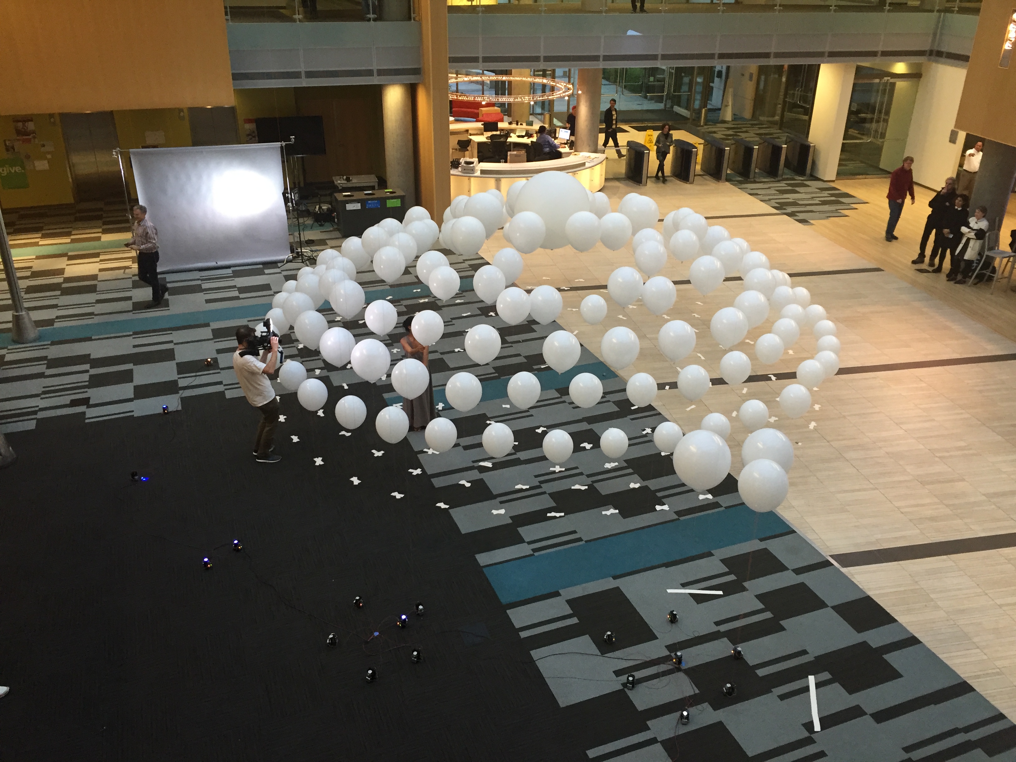
While the difference over the years is striking, this comes to life when we depict these numbers with tangible objects, in this case, balloons. The bottom 90% is depicted by a large, static mass of balloons, whose volume is sized proportionally based on the size of the US population it represents. Its height changes little over time. As time moves forward, though, a smaller mass, representing the top 1%, moves marginally upwards. The real motion, though, is seen in a single, small balloon representing the top .01%, which shoots skywards to levels never seen in the 1900s.


People

Principal Researcher
Microsoft Research

Artist in Residence
Microsoft Research

