How often are patients coming back? A healthy PowerPivot study
As was recently observed by web analytics and download feedback, there is a lot of interest in PowerPivot within the Healthcare industry. A recent blog posting noted that healthcare was the top industry when viewing PowerPivot Interest by Industry. One of the key reasons is that while healthcare systems have a lot of data (i.e. patient transactional data), it is often left to the analyst using Excel to understand the meaning behind all of this information.
How often are patients coming back?
A common question in hospital settings is that once a patient who has stayed at a hospital leaves (i.e. discharged from the hospital), how often are they coming back to the hospital (i.e. readmitted to the hospital). This type of re-admission analysis is very important because it ultimately allows analysts to determine why patients are coming back to the hospital within a set number of days of being discharged.
Healthcare Readmission Analysis Example Scenario
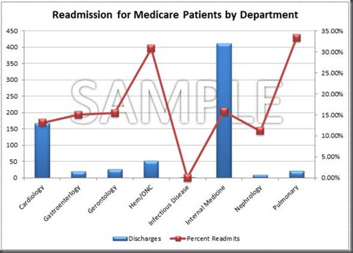
Below is an example screenshot of obfuscated sample readmission data from a healthcare customer. As you can see, there are some large disparities between department discharges (in blue) and the re-admission rates (in red). For example, while the pulmonary department has relatively few discharge cases, they have the highest re-admission rate near 35%. Meanwhile, internal medicine has the largest number of discharges, yet one of the lower readmission rates.
Why is this important?
There are many reasons why these disparities exist. For example, pulmonary medicine will often see higher readmission rates because the complexities involved (e.g. asthma, COPD, cystic fibrosis, etc.) while internal medicine will see lower re-admission rates because of the larger number of patients (i.e. internal medicine encompasses a lot of different sub-specialties). While this is outside the scope of this blog, the key point here is that with PowerPivot, our healthcare customer is now quickly able to understand readmission rates of their patients. With this information in hand, they can now perform further analysis to understand the root causes of the higher readmission rates and the possibility to reduce preventable reasons for readmission (e.g. incorrect prescription, adverse reactions, etc.)
Understanding re-admission analysis allows us to reduce the cases of preventable patient re-admissions. This saves money, time, and improves patient health. As noted, in CMS’ Stealth Health Reform, re-admissions are an indicator of quality failure and 75% of all re-admissions are preventable. And reimbursements for some of re-admissions may be modified or denied if deemed preventable.
… And we can now do this analysis with PowerPivot.
Why PowerPivot?
Because PowerPivot for Excel is an add-on to Excel, analysts were able to focus on understanding the data instead of focusing on learning the new technology. As with most healthcare IT departments, there is a lot of data coming from a lot of different databases and vendor systems. With PowerPivot, they were able to quickly import in data from the many disparate data sources and immediately start analyzing. Once the analysis was completed, they can securely share this information within PowerPivot for SharePoint.
Discussion
I had enjoyed working with our healthcare customer on their PowerPivot project. Because what we were doing here wasn’t just testing out PowerPivot’s features and creating analysis for the sake of analysis. With PowerPivot, they were now able to perform readmission analysis – one they were not able to do before – in a matter of hours. In a matter of hours, we could start helping patients stay healthy.

