
Breaking down hierarchical data with Treemap and Sunburst charts
So far, we introduced you to our new cast of modern chart types and placed the spotlight on Waterfall charts—the classic financial powerhouse chart. Today, we dive deeper into the Treemap and Sunburst charts to help you visualize hierarchical data beyond the classic bars and circles. Bold and modern, the Treemap and Sunburst charts complement and strengthen the existing proportional chart types, like pie, doughnut and stacked column.
What is hierarchical data and what does it look like?
Hierarchical datasets are perfect for layers within the data where natural groupings exist. They can be organizations within a business, regions within a country, makes or models of a product, or disciplines within a subject. Hierarchical data just requires some level of order and organizational structure. The example below, following a small bookstore inventory, illustrates the look and feel of hierarchical data.
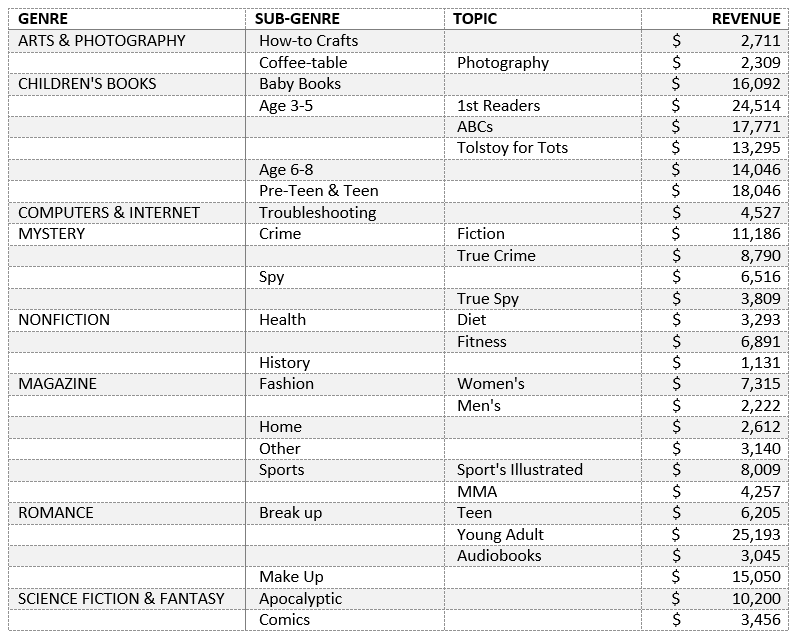
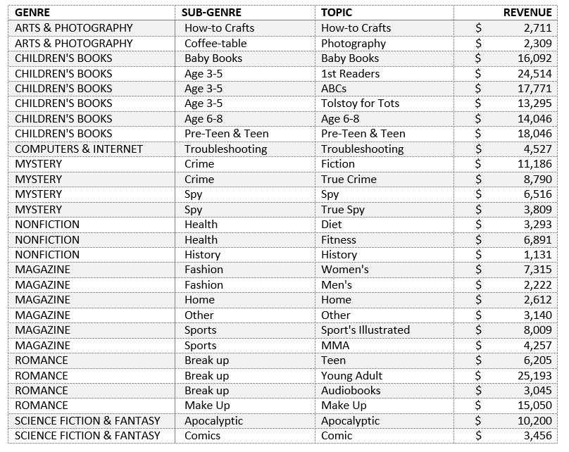
Notice the table headings: Genre, Sub-Genre and Topic. These naming conventions create a hierarchical dataset. Topic is a subset of Sub-Genre, while Sub-Genre is a subset of Genre. Recognizing data within a hierarchy is intuitive and simple. In a sparse hierarchy form of data, like the example above, the parent—the category that represents a collection of data points (e.g. Genre)—is identified to the left. In the case of an empty cell, the parent category is the previous (or above) line item. If all the cells were filled out, like in the example below, a Treemap or Sunburst chart can still be created.
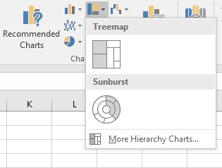
Regardless of the format of your hierarchical data, you can create a Hierarchy Chart by clicking the Treemap or Sunburst icon on the Insert ribbon to reveal insights into your data.
Picking between Treemap and Sunburst
After getting acquainted with the concept of hierarchical data and the Treemap and Sunburst charts, you might wonder, “Why use one over the other?” The answers lie in what information you want to convey in the chart. Treemaps, by their rectangular nature, are better suited for comparison among hierarchical levels. Just in the way our minds differentiate size and shape, rectangles and straight lines are easier to compare than slices and angles. Treemaps are optimized to show lots of data, because it stretches to within its bounding box, whereas plotting a Sunburst is fitting a circular chart into any rectangular window. Space that could be used to tell a story with your data is lost in the corners.
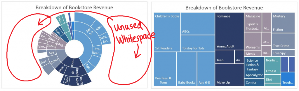
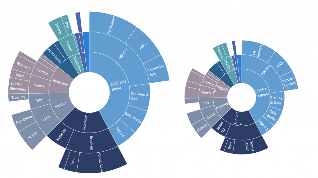
When space is not an issue, Sunburst shines through by painting the full picture of the hierarchy and thereby illustrating the different depths of hierarchical groups. A Treemap loses the categories in the middle. Upon further analysis of the “Children’s Books” at the top-left of Treemap, the Sub-Genre of “Age 3-5” is not shown, whereas the Sunburst adds that additional layer of information in the same colored slice. From the Sunburst, we know “ABCs” and “Tolstoy for Tots” are grouped together under the “Age 3-5” parent group.
Sunburst also wins in adding the dimension of depth to each parent branch. The Sunburst unveils that the “Children’s Books” Genre has Sub-Genres that extend into specialty topics. In your work, use the uneven branching to emphasize and draw attention to a single slice, further teasing apart the contributions. For example, a sales report may want to highlight a specific month. A deeper look into that category will elicit more insights and naturally draws attention to your message.

Tips to create hierarchical charts
We want you to design beautiful charts that are intuitive and friendly. With that in mind, we grouped associations by color. Displaying all data labels—especially long ones—would give the illusion that your chart is uncomfortably bursting at the seams. So labels are automatically truncated or dropped off of the visual to produce an elegant, uncluttered look. Simply enlarge the size of the chart to add more information in a clean, measured way. The Sunburst on the right shows fewer data labels since there is less chart real estate to display information.
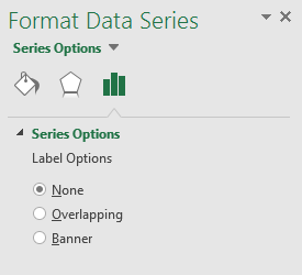
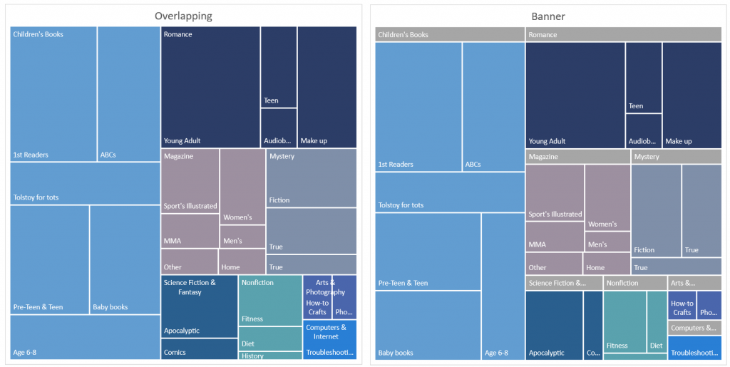
Treemap has the added benefit of adding parent labels—labels specific for calling out the largest parent groupings. To display these options, double-click anywhere on the Treemap, and the Formatting task pane appears on the right. Under the Series Options, you can snap and toggle between Overlapping and Banner, or have no parent labels at all.
The label options for Overlapping and Banner are shown below, respectively, for side-to-side comparison.
Your turn
Try out Treemap and Sunburst, along with the other new charts, in the Office 2016 Public Preview and create a look for your data unlike any other chart you have previously used in Office.
If you have any comments or questions, please feel free to leave them below.
- Learn more about using the Treemap chart type.
- Learn more about using the Sunburst chart type.
—The Excel team