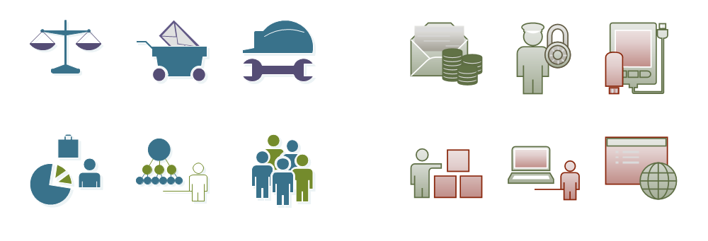
Create professional diagrams quickly with the new Visio
When we started our planning process for this version of Visio, we made it a central goal that it would be easier, faster and more pleasant to create beautiful, professional looking diagrams. To achieve that, we made a host of improvements to the application – far too many for us to cover here. So, for this post, I’ll aim to give you an overview of all the changes we made and cover a few of the most highly requested new features. Later posts will cover everything here in much more detail.
Great Looking, Professional Diagrams
Making diagrams that can effectively communicate information is the heart and soul of Visio. Polished, professional looking diagrams grab attention, inspire more confidence, communicate more effectively and reflect well on the people who made them. It’s always been possible to make good looking diagrams in Visio. This version we not only wanted to make it possible to create amazing looking ones, we wanted to make it startlingly simple. In fact, I might go as far as to say we wanted to make it hard to create bad looking diagrams in Visio (yes, yes – I am sure you could still do it if you tried!)
The foundation for great looking diagrams in the new Visio is the integration of the same rendering engine that PowerPoint uses. So, all the cool effects and UIs you’re familiar with from PowerPoint are now in Visio too!
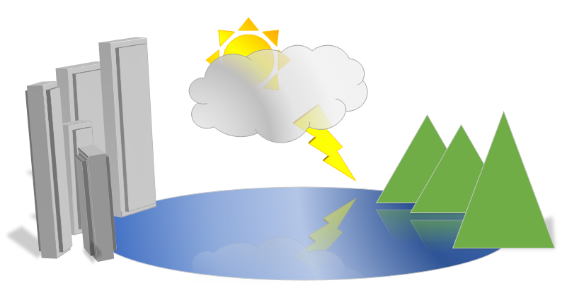
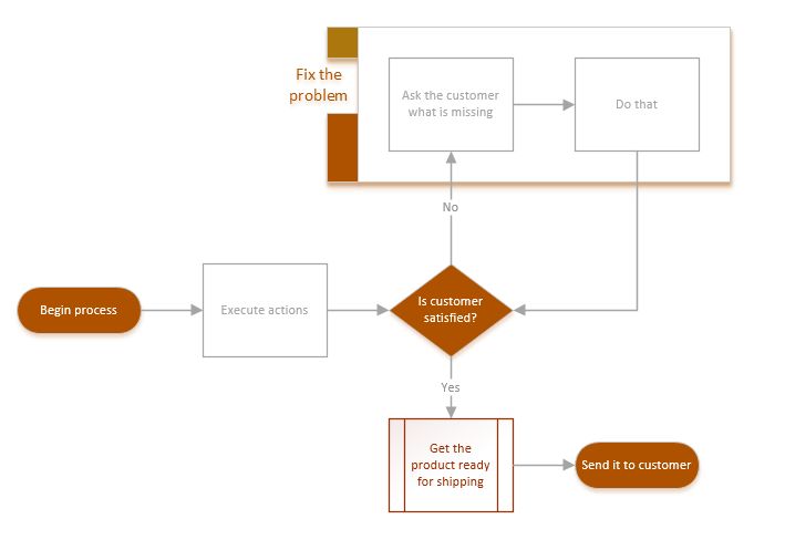
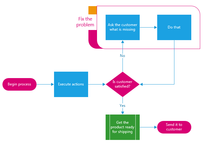
All that power is great, but it’s like having a jet fighter without a pilot. It’ll do amazing things, if only you could figure out which button to push! Fortunately, we weren’t just aiming for the fighter pilot demographic. To make it incredibly easy to use all that power to get the look you want, we dramatically overhauled our theming feature. You just need to pick from among over 25 brand new, amazing looking themes and Visio will go and update the formatting on all your shapes to match that style.

Here’s an image of the same diagram in three different themes. You can change between the following diagrams in a single click, easily moving from simple to vibrant to informal:
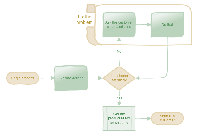
Of course, we’ve also made updates across huge swaths of our content to freshen up its look and to take advantage of all the power of our new effects and themes. I’ll call out a few of the templates we’ve updated down at the bottom of this post.
Fantastic to Use
Using Visio has always been great. We love receiving feedback that starts with “I love this program” (and doesn’t follow that with ‘but’)! We wanted to keep pushing on making the program fantastic to use to ensure that people keep finding the experience of using Visio to be efficient, intuitive and even – perhaps – enjoyable!
To achieve this, we invested across the board in polishing the product. We streamlined the ribbon and made our contextual UIs much more complete and focused. More commands than ever are now available right at your fingertips, which helps keep you focused on building your diagram instead of searching through complex UI to find the command you want. Try collapsing your ribbon in the new version and see whether using the right click menus makes you more efficient!
Outside the command space, we fixed hundreds of little road bumps (bugs 🙂 that folks told us about when using the product, and we built out several major features that customers have been craving for a while. We also dramatically simplified our application look, so that the diagrams you’re making will take center stage, instead of needing to compete with Visio’s UI. Lastly, we added a raft of smooth transitions, which make the program much easier to follow, as well as making it a lot more attractive to use.
All in all, we are tremendously excited about how great using the next version of Visio is and we’re thrilled that you all will finally get to give it a try.
So, those new features… ?
Yeah – I’ve got examples. Now that you’ve got the summary, I’d like to dive into a few specifics here. We’ve got later blog posts planned that will cover theming, effects and the command improvements – so I’m going to hold off on them. However, I would like to talk a bit about some of the top requested customer features that we’ve built as well as walk through some examples of templates that we’ve updated.
Change Shape
Change shape is one of the most highly requested customer features we’ve ever had. It’s not hard to see why. How many times have you dropped a process shape and connected it up, realizing later it should have been a decision? Or, have you ever wanted to give your simple decision shape more impact by subbing in one of the cool Visio Workflow shapes?
Changing a shape is now as easy as clicking a button and picking the shape you want. You can change one shape at a time or change several multi-selected shapes at once. This makes it easy to rough in a diagram with temporary shapes and then change to better looking, more accurate, or more appropriate shapes when you are ready to finish the diagram. You don’t have to worry about losing connections, formatting or settings; Visio transfers all that over to the new shape automatically.
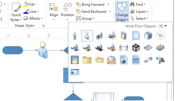
If you don’t see the shape you want in the Shapes pane, you can use Search to find it and the search results appear in the Change Shape choices. To make changing the shape even quicker, you can use Change Shape from our right-click menu (we call it The Floatee).
Duplicate Page
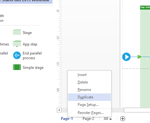
Another highly request feature has been the ability to quickly duplicate a page. Right-clicking on the page tab and selecting Duplicate now creates a new page with all of the shapes, formatting and properties of the original. You can use this to quickly create variations of a diagram or to use a particular page as a starting template for many others or to simply explore different layouts – all without risking the contents on your original page. Combining Duplicate Page with Change shape also allows you to quickly try out using different shapes as well.
Finding shapes
It’s now much easier to find the shape you want. Search has been updated with new keywords to give better results and the results are organized more clearly and grouped by stencil. You’re shown up to the first four relevant shapes in each stencil and when you find the shape you want you can add it to your diagram or add in the whole stencil to the Shapes Pane with one click.

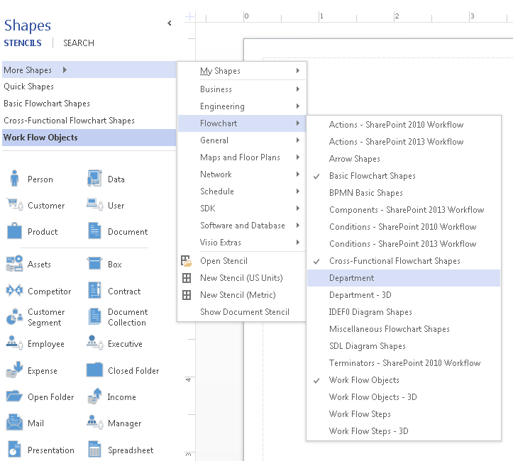
If you prefer to browse for shapes, we’ve also updated the More Shapes menu to make it easier to preview stencils and let you add or remove multiple stencils at once.
Updated Templates
As I mentioned, we’ve also updated a huge portion of our content this release. There’ll be a whole article detailing what we’ve done later, so I just want to give you a taste here to illustrate a few of the changes that we’ve made.
Organization Chart
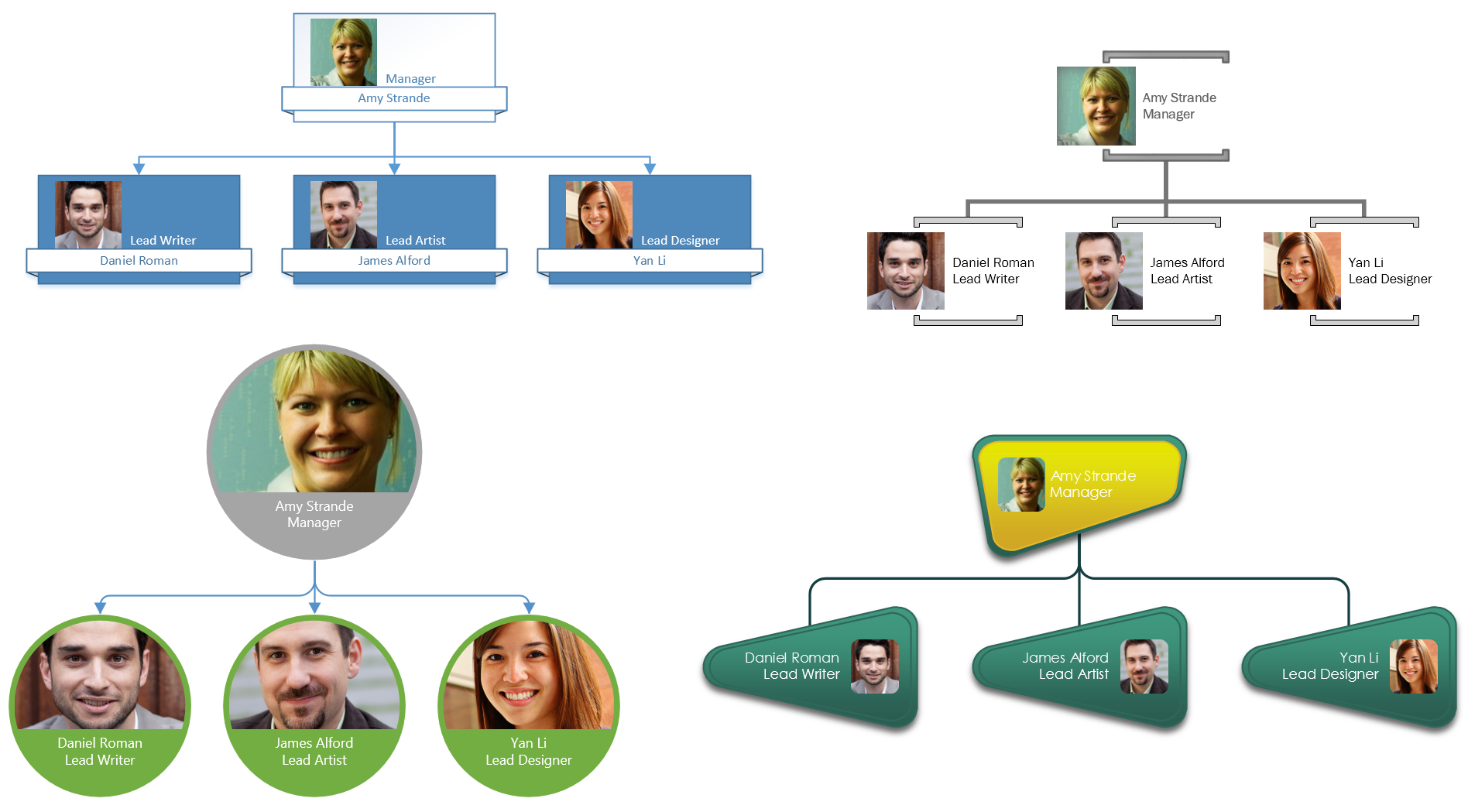
Org Chart has been reworked with 10 completely new styles, each with its own unique look. We’ve made the use of pictures super easy as well. The net result is that in a few clicks you can make org charts with incredibly varied styles that range from minimal to professional to hip to playful – whichever is appropriate for the personality of your team or organization.
Improved Containers and Callouts
Containers were already a powerful tool for diagram creation and they’re even better now. Not only are there new containers for you to use, we’ve also added the ability to format containers with a variety of new looks. Whether you want something purely functional or more stylistic, it’s easy to customize a container. Once you’ve selected a container style you want, you can change the heading style and use themes or quick styles to make it look just like you want.


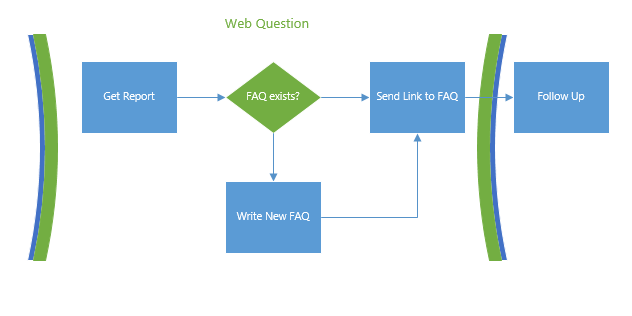
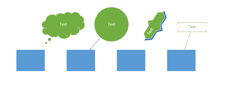
Like containers, new callouts give you options to give your diagrams a customized look. Callouts have been completely reworked to provide more choices and more formatting options. You can quickly integrate the look of your callouts to your diagram with Themes, or use Quick Styles to draw special attention to a specific callout.
Basic Network and Detailed Network diagrams
New versions of these diagrams have updated shapes with a simple, modern look. In addition to making it easy to produce incredibly professional looking diagrams, these shapes are updated to include the newest hardware and concepts. We’ve also made the most important semantic details of the shapes more visually salient – making it easier to read large, complex diagrams.
Workflow Diagram
There’s also a new version of the Workflow diagram that shares the modern look. Like the network shapes, you’ll find they can add flavor to other diagrams.
Don’t worry, though, the old 3D network and workflow shapes were so popular and iconic that we couldn’t take them out. So, you can still find them by searching or browsing through the template categories.
Basic Diagram
The Basic Diagram template is a great toolkit to start a generic diagram or to use in an existing one, and we’ve updated it to give you a wider variety of attractive and useful shapes. You’ll be able to use them to make quick drawings or add them to other diagrams to help illustrate your information. We’ve added lots of new shapes, including decorative shapes, arrow shapes, graph and math shapes.
Make the Most of Your Diagrams
And even with all that, we’ve just touched the tip of the iceberg on what the new Visio can offer. Check out our upcoming blog posts for deep dives on everything I touched on above.
We hope that you’ll find it easier, faster and more pleasant to create beautiful, professional looking diagrams in Visio than it has ever been before!
Contact us
We would love to see your comments on this and other blog posts and if there are other topics you’d like to see us cover, let us know.


