Introducing Word 2013
Today Tristan Davis, Senior Lead Program Manager on the Word Team, introduces you to Word 2013.
Last Monday, we announced the Office Customer Preview – now that the Preview is publically available, I wanted to kick off a series of Word 2013-focused posts by giving you an introduction to the new release, as well as the underlying philosophy that drove the investments we’ve made.
Part of the new Office
Office 2013 as a whole is a significant update to the apps you know and love – across the board, we’ve done a ton of work to ensure this version is:
- Integrated tightly into the cloud, allowing you to easily keep all of your content (and the apps themselves) accessible everywhere
- At home on Windows 8 with a refreshed, Metro-style look/feel, that still feels familiar to both novice and advanced Word users
- Tailored for both keyboard/mouse and pen/touch, enabling you to be productive on all of your devices
Those Office-wide investments are directly reflected in the changes you see in Word 2013 – one of our most important goals with each update is ensuring that you have a consistent, familiar experience across all of the applications you use.
Defining Word 2013
Within that, our team’s philosophy for this release was simple:
- We will invest deeply in a set of scenarios that are shared across all of the Office applications (like the ones I described above)
- We will continue to focus on polishing existing user experiences/scenarios over “adding new features”, driving ourselves to make improvements in the things that users already do every day
I believe that the changes you see in the Preview demonstrates our commitment to ensuring that all of the work we did was in support of those two principles, and results in changes that you’ll see and appreciate on a daily basis.
When we took those principles and used them to prioritize the list of potential investments this release, we ended up with a set of five “pillars” – it’s these pillars that guided the team all the way from concepts to what you see today:
- Polished Core User Experiences
- Best on Windows 8
- Integrated into the Cloud
- Friction-Free Collaboration
- Great for Digital Consumption
Polished Core User Experiences
There are a set of things that people do in Word every day, and we know that making those things work better is more powerful than just about any new feature we could add, so we spent a lot of time understanding where users had trouble and where the design just didn’t feel right, and optimizing those core experiences. Here’s a small set of the improvements we’ve made:
- Working With Figures
- Live Layout – as you move/resize/rotate a picture within a document, Word will show you its position in real time, so you can position it “just right” the first time.
- Alignment Guides – to help you get things exactly where you want them, Word will display guides that help you put that picture right at the top-right margin, in the middle of the page, etc. and ensure they stay there
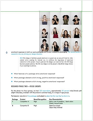
- Layout Options – This one is one of my personal favorites; whenever you click on a picture/chart/SmartArt, a button will appear to its top right that lets you easily wrap text right there in context.

- Working with Tables
- One-click Row/Column Insertion – The most basic action in a table is “add another row”, so we added the ability to do that in context, by going to the place where you want the new row to appear and clicking the button to add it.

- Improved Border Tools – People pull their hair out over getting table borders just right, so we created a Border Painter to let you apply the borders you want by brushing them on directly with your mouse.
- Refreshed Table Styles – We also refreshed the set of default table styles to provide more options that coordinate well within your document, and enable you to present all kinds of information clearly and confidently.
- One-click Row/Column Insertion – The most basic action in a table is “add another row”, so we added the ability to do that in context, by going to the place where you want the new row to appear and clicking the button to add it.
- Working with Headers & Footers
- Document Info – When we mined the user feedback on headers and footers, the thing that stood out above everything else was that there were a small set of things you wanted to easily add to the header or footer that weren’t available as immediately as they should be. The Document Info button now includes each of those top items, letting you add them with a single click.

- Document Info – When we mined the user feedback on headers and footers, the thing that stood out above everything else was that there were a small set of things you wanted to easily add to the header or footer that weren’t available as immediately as they should be. The Document Info button now includes each of those top items, letting you add them with a single click.
- Working with Themes and Styles
- Design tab – We know that you spend a lot of time making your documents look polished and professional, so your message is presented in the best light possible. The Design tab brings all of the tools needed to create a great-looking document into one place, so you can easily create a unique, beautiful look for each document you create.

- Refreshed Text Styles – We also refreshed the default text styles for Word, adding a crisp/clean set of headings that look great and feel modern/fresh.
- Design tab – We know that you spend a lot of time making your documents look polished and professional, so your message is presented in the best light possible. The Design tab brings all of the tools needed to create a great-looking document into one place, so you can easily create a unique, beautiful look for each document you create.
- Document Layout – As well as the specific improvements you’ll experience above, we also updated the core layout engine in Word. This isn’t a change you’ll immediately see, but it’s one that you should feel, as even the most complex layouts work predictably and reliably.
Best on Windows 8
The new version of Word is at home on a Windows 8 PC, whether it’s a desktop, a laptop, or a tablet, as we’ve optimized the experience around the unique needs of each of those scenarios.
- Touch everywhere – When you use your fingers to work with Word on a tablet, the Ribbon expands to make commands easier to tap, handles on pictures expand, the selection gets “handles” to make it easy to change, and a specialized MiniBar puts the most common commands right at your fingertips (pun intended).
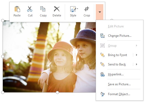
- Inking – As well, if you’re using a pen, you can easily ink on the document, in the margins, or in comments.
- Included in Windows RT – Word 2013 has also been optimized for ARM-based Windows 8 devices, and will be included on Windows RT devices like the Microsoft Surface.
Integrated into the Cloud
People are using more devices than ever before, and we wanted to make sure that your Word experience travels with you wherever you are and on whatever device you are using. As a result, Word is tightly integrated into the cloud, ensuring that your data, your documents, and Word itself can move with you from device to device.
- Save to SkyDrive – Word 2013 makes it easy to save all of your files in the cloud by default, so they’re always available to you whenever you are. They’re also always cached, so they’re available even when you don’t have an Internet connection.
- Roaming MRU – Whenever you’re signed in to Word 2013, we’ll store a list of documents you’ve recently opened in the cloud, so when you move from your laptop to your desktop, you don’t have to go looking for them again – they’re right there. And if you pin a file to your MRU on one machine, it’ll be pinned to the list on all your devices.
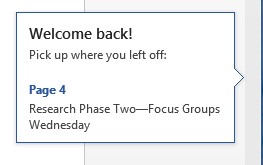
- Resume Reading – Within those documents, Word also keeps track of where you’re currently reading, and that digital bookmark is stored in the cloud as well. So if you’re reading on the bus on the way to work, when you log in to your desktop at the office and open that file, we’ll get you right back to where you were when you last stopped.
- Apps for Office – Office’s extensibility model is also moving to the cloud, with a new extensibility model based on web standards (JavaScript for the logic, and HTML/CSS for the presentation), and deployed via the cloud (yes, VBA is still there too). This new model allows you to build powerful web-backed solutions for Word documents.
Friction-Free Collaboration
Just as I said above that most people use more than one device, most work that’s done these days isn’t done by one person in solitude – it’s the product of collaboration between many people, working together to create something great. We know that enabling that is a critical part of Word’s job, so we’ve added a bunch of tools to enable seamless collaboration around a document.
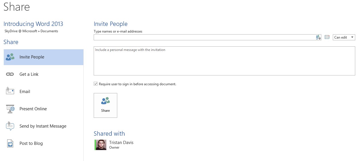
- Simplified Sharing – Through the Backstage, it’s easy to share documents with the people you’re working with, so you can all easily access the document to work together. When I share, I can easily choose both who I’m sharing with, and how I want to share (Do I want you to edit, or just read? Do I want you to be able to share with more people, or is this invitation just for you?)
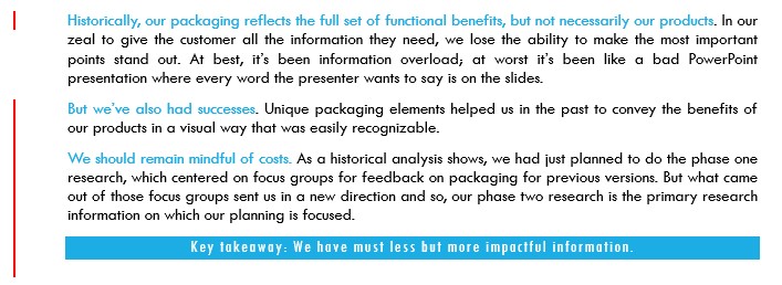
- Simple Markup – When groups of people are working on a document together, Track Changes is a commonly used tool to make sure that everyone can see “who changed what when” in the final product. The result of that can be a document that’s hard to read, as all of the tracked revisions make it hard to see what the current state of the document is. Simple markup hides the revisions behind a single red change bar, and lets you show/hide the details by clicking on it. In other words, instead of having to figure out the result of changes that are marked up like this:

You’ll see just the final version in its easy-to-consume form, with the details hidden behind the change bar, like this:
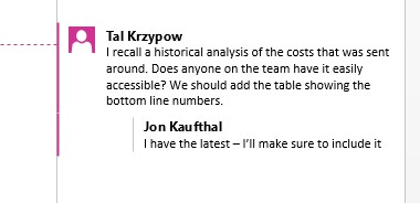
- Comment Replies / Mark Comments “Done” – Comments are a powerful tool when working on a document with others, and we’ve added functionality to address the two common requests: you can now reply to a comment, to have a discussion about a specific item, and you can mark a comment “done”, so you don’t have to delete it to communicate that you’ve taken action on its contents.
- Lock Tracking – If you want to ensure that all changes to a document are tracked, you can require a password to ensure that the people you’re working with don’t accidentally turn it off.
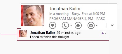
- People Everywhere – Finally, you’ll notice that the names in comments aren’t just names anymore; they’re associated with the people that made them, so you can both see their picture, and hover over it to contact them via phone/IM/email without leaving Word.
Great for Digital Consumption
We know that there’s a LOT of reading that happens in Word – nearly two-thirds of user sessions in Word contain no editing at all. As a result, we built a refreshed, modern reading experience for Word 2013; the goal was to create a clean and distraction-free environment that went beyond presenting an electronic equivalent of paper to create an experience that feels at home on all types of devices – from tablets to laptops to smartphones, all the way to 30 inch monitors on a desktop PC (if you’re lucky enough to have one).
- Read Mode – To optimize Word for the times when you are focused on consuming, not creating, content, we added a new Read Mode that contains a bunch of features aimed at making your reading experience as easy and efficient as possible:
- Column Layout – One of the virtues (and pitfalls) of “paper” layout (i.e. 8.5×11 or A4 pages) is its rigidity – the pages are always the same size, regardless of whether those pages fit comfortably on your screen or not. And often, they don’t. We’ve watched countless times as users end up scrolling back and forth on their phone with each line that they read, forced to make an awkward tradeoff between a comfortable text size, and a size that “fits” the screen on which they’re reading. Read Mode’s column layout reflows the document to the constraints of the device on which you’re reading, ensuring that reading feels as comfortable on a 7” screen as a 24” one – a set of columns fit to the screen that scroll left to right.
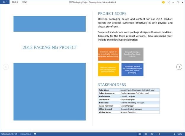
- Object Zoom – When the document’s content is reflowed, pictures/charts/tables in the document are also resized to fit in the resulting columns – often, that means that they’re reduced from their original size. However, those elements can be the most information-rich part of a document (and hard to read when they’ve been shrunk down), so you can easily zoom “into” the object with a double-click or double-tap, bringing it front and center and allowing you to enjoy full focus on it at its original size.

- Definitions/Translation – One of the most common causes of reading disruption is the need to look up additional context – for example the meaning of a word or additional background information about a concept. When in Read Mode, those tools are right there in context.

- Column Layout – One of the virtues (and pitfalls) of “paper” layout (i.e. 8.5×11 or A4 pages) is its rigidity – the pages are always the same size, regardless of whether those pages fit comfortably on your screen or not. And often, they don’t. We’ve watched countless times as users end up scrolling back and forth on their phone with each line that they read, forced to make an awkward tradeoff between a comfortable text size, and a size that “fits” the screen on which they’re reading. Read Mode’s column layout reflows the document to the constraints of the device on which you’re reading, ensuring that reading feels as comfortable on a 7” screen as a 24” one – a set of columns fit to the screen that scroll left to right.
- Web Video – With more content being read digitally every day, documents are now able to include content like video that doesn’t have a perfect analogue in the physical world. Word 2013 lets you include video from web video sources like YouTube directly in your documents, and allows you to play them back right within the context of the document itself.

- Navigation Pane Improvements – As well, we know that many folks rely on the Navigation Pane when they’re reading content in Word, so we’ve refreshed and modernized it as well. One specific addition that I love is that as you read, the navigation pane will update to show you where you are in the document, even if your cursor isn’t on that page (so as you’re reading, you can always look and see where you are in the context of the overall document).
So Much More…
Talking about the release, I kind of feel like a proud parent – there’s just so much great work that was put into this update, and over the coming weeks the folks on the team will share that with you in much more detail, so please stay tuned.
But, before I’m done, I wanted to touch on two additional important things about the release, investments important enough that they deserve special mention:
- First, we have added the ability to import PDF files into Word via PDF Reflow. This is an incredibly common feature request, so it’s really exciting to finally be able to enable it – with this functionality, you can transform your PDFs back into fully editable Word documents, rehydrating headings, bulleted/numbered lists, tables, footnotes, etc. by analyzing the contents of the PDF file.It’s worth noting that this doesn’t make Word a PDF viewer; our goal wasn’t to be a full-fidelity PDF viewer like the Windows 8 Reader app; instead, we explicitly focus on making the file editable again, even if that causes the layout to change slightly so that it behaves like a familiar Word file.
- Beyond all the exciting enhancements above, the team also spent significant time to address known issues that have been reported, ensuring that we’re always improving the application’s core stability, even as we add to it. I know we might not have fixed every bug you’ve seen, but we make a conscious effort to ensure that we continue to push the level of polish higher and higher with each update.
– Tristan

