 By guest blogger Ellen Finkelstein, PowerPoint MVP and author of many PowerPoint skills books. To learn more about her books, and get free tips and reports go to www.ellenfinkelstein.com.
As a presenter, you probably use charts (also called graphs) in your presentations. Charts display data in a visual format that audiences can easily grasp – if you design the chart and slide clearly and crisply.
A crisp chart has nothing to do with your toaster’s setting. Instead, it’s a chart that shows only the data necessary to make the desired point clear – no less, no more. Too much data (sometimes called “data dump”) will overwhelm your audience, blunting your message.
Limit the Data
Instead of creating a chart from data in an entire Excel spreadsheet, first edit your spreadsheet. One way to do this is to copy and paste data onto a separate Excel workbook tab. Then look at what you can eliminate. When you have only the data you need, you’re ready to create the chart in PowerPoint.
Tip: If your data just has to be huge, see if you can divide the data into two sets. For example, you could cover two related sets in one table and two other related sets in another. These two tables, or sets of data, would end up being two easily digestible slides, instead of one overloaded slide.
Creating the chart
There are several ways to generate a chart in PowerPoint from Excel data, but here we’ll talk about one way. Let’s assume that you’ve already edited an Excel spreadsheet so that it contains only the data that will support your message.
Here are the basic steps to create the chart in PowerPoint from a data set:
1. Use a slide with a layout that contains content and click the Chart icon, or choose Insert tab, and then Insert Chart. To change the layout of an existing slide, right-click off the slide, choose Layout, and choose Title and Content or another layout with the word “Content” in its name. 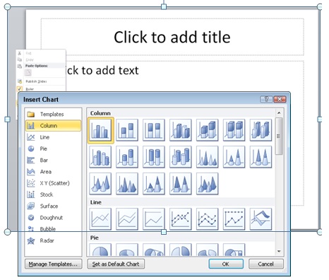
2. The Insert Chart dialog opens. Choose the type of chart you want. For this example, I’ll choose the default 2D column chart. Click OK.
Note: Some types of charts are appropriate for specific types of data; your chart type should match your data. For example, if you have one row of data showing percentages that make up a whole, a pie chart would work better than a column chart.
3. When you click OK, a temporary Excel spreadsheet opens, with dummy data. This spreadsheet is named “Chart in Microsoft PowerPoint.” Now navigate to your Excel spreadsheet that contains the data you want for your chart, select the data, and copy it to the clipboard. 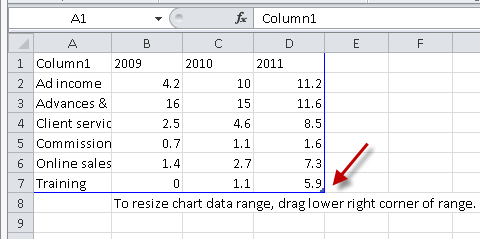
4. Go back to the temporary spreadsheet, click in cell A1, and paste.
5. If your data is smaller than the dummy data, you’ll need to drag the lower right corner of the blue border inward; in the figure, a red arrow points to this corner.
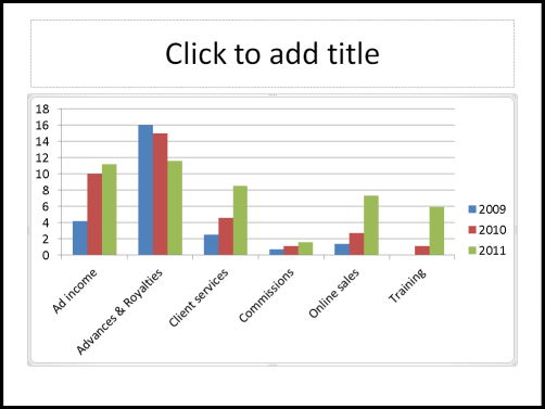
6. Go back to your PowerPoint slide to see the chart
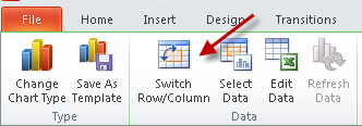
You may need to switch the columns and rows, which you do by clicking the Switch Row/Column button on the Chart Tools Design tab. Here you see the default column chart before and after clicking this button (and also adding a slide title).
Formatting charts for clarity
You’re not finished yet! PowerPoint’s default charts are overly busy and are rarely formatted in a way that’s easy to understand. Also, PowerPoint has many useful features that you can take advantage of to help you communicate your points clearly.
I can give you some best practices for clear charts, but in the end, you have to decide what is best for your message, your data, and your audience. Here are some ideas that should help you get the results you want.
Use 2D charts
3D charts are notoriously hard to understand. Which is the true value, the front or the back of the column? People aren’t sure. The “walls” and “floor” of the chart make it seem overly complex. Finally, the 3D perspective makes quickly judging values harder. Just switching to a 2D chart instantly makes the chart look easier to understand.
Luckily, PowerPoint 2007 and 2010 default to the 2D style, but PowerPoint 2003 had a 3D default and many charts out there still use that style. To change to a 2D chart, select the chart. On the Chart Tools Design tab, choose Change Chart Type.
Consider changing the chart type
As I mentioned, you should choose your chart type based on your data and the point you are trying to make. Column charts are the most common, but that may be because they are the default. When you’re trying to show trends, a line chart can make the point clearer.
Many people don’t like line charts because the lines are too thin to show up clearly, but you can easily make them thicker. First, try one of the chart styles from the Style gallery; the options near the bottom use thicker lines.
If the lines still aren’t thick enough for your taste, follow these steps to make them as thick as you want:
- Select a line in the chart.
- Click the Chart Tools Format tab.
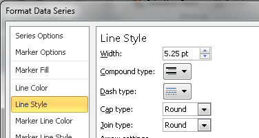
- In the Shape Styles group, click the Shape Outline button, then choose Weight, More Lines to open the Format Data Series dialog box with the Line Style category active.
- In the Width text box, type a larger width or use the Up arrow to increase the width.
- With the dialog box still open, select each remaining line, click the Line Style category, and choose a new width. You can even vary the widths to emphasize one data series over others.
Widen the bars
If you choose a column or bar chart type, widening the bars can make the chart clearer. The steps to widen the bars are not intuitive, so many people miss them. Here they are:
- Right-click any column or bar and choose Format Data Series. The Format Data Series dialog box opens. (Tip: Drag the dialog box off the chart, so you can see the result as you do the next step.)
- With the Series Options category selected, drag the Gap Width slider to the left, toward the No Gap label. All of the columns or bars widen.
- Click Close to close the dialog box.
Remove the gridlines and use data labels if necessary
The purpose of gridlines is to help your audience figure out the exact value of the data points. Is that sales number $3.5 million or $3.4 million? But when you display a presentation on a screen, your audience can’t easily follow the gridlines. Moreover, the gridlines are a distraction from the chart itself.
In some situations, you need to convey exact numbers. In others, an approximation is fine because no one cares. So you should base your choice of whether to use gridlines on both the goal of your presentation and your audience’s needs.
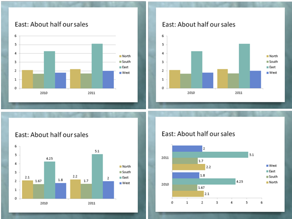
One way to get rid of the gridlines and still provide exact data is to use data labels. In fact, data labels will show your audience the numbers much more clearly. The only trick is to make sure that you don’t have too many numbers on the screen.
Here you see the evolution of a chart from grid lines to data labels. Follow these steps:
1. Click the grid lines, but not the top or bottom ones (because you’ll select the plot area instead of the grid lines).
2. Press the Delete key on your keyboard to delete the grid lines.
3. With the chart selected, click the Chart Tools Layout tab, choose Data Labels, and then Outside End.
4. If the data labels are too long and overlap, try a bar chart. On the Chart Tools Design tab, click Change Chart Type, choose one of the bar charts, and click OK.
What other options are useful?
PowerPoint has so many options for formatting charts, so I’ll just make a few comments.
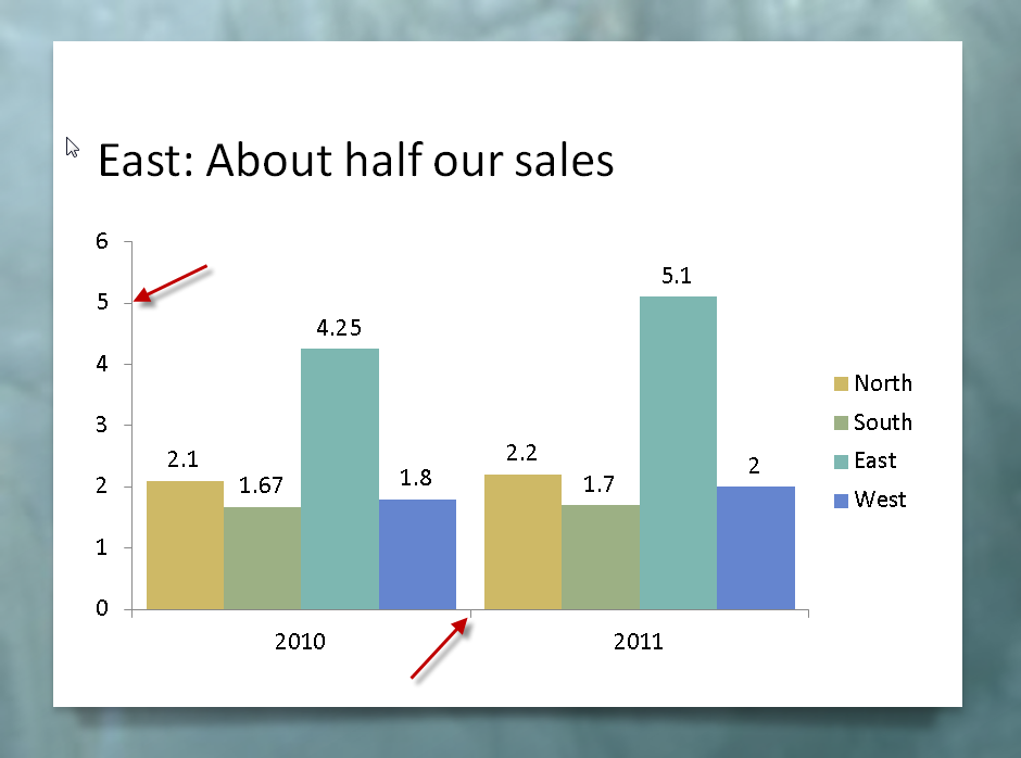
Tick marks are small lines along the axes and they are usually unnecessary. They aren’t very noticeable, but getting rid of them will make your chart look cleaner. The red arrows in the figure point to the tick marks. Here’s how to remove them:
- Click an axis to select it. The easiest way to make sure you select the axis is to click its labels.
- Right-click the axis and choose Format Axis.
- In the Format Axis dialog box’s Axis Options category, from the Major Tick Mark Type drop-down list, choose None.
- Select the next axis and repeat the previous step.
- When you’re done, click Close.
Some charts have a chart title, but in most cases, I recommend using the slide’s title instead. To delete an existing chart title, just select it and press the Delete key.
Sometimes the legend is in the way of expanding the chart itself. You can select it and drag it to a better location. Then, to expand the rest of the chart, click the Plot Area (try clicking inside the main area of the chart) and drag its handles outward.
PowerPoint chooses the Y axis scale and numbers based on the data, but they don’t always work well. A common task is to change 12,000,000 to 12. With the shorter version, people will remember the numbers better. Follow these steps:
- Click an axis to select it. The easiest way to make sure you select the axis is to click its labels.
- Right-click the axis and choose Format Axis.
- In the Format Axis dialog box’s Axis Options category, from the Display Units drop-down list, choose the units you want. In the example, you would choose millions.
- If you want to show the display units, check the Show Display Units Label on Chart checkbox.
- If you want to show decimal values on the Y axis, click the Number category in the dialog box. From the Category list on the right, choose one of the options, such as Number, to set the decimal places and other number formatting.
- Click Close to close the dialog box.
Calling out important points
No matter how simple you make your chart, it can seem overwhelming to your audience. You are familiar with the data, but the people watching aren’t. Also, you may need to point to specific sections of the chart as you discuss them. Walking up to the screen and pointing is usually awkward and ineffective, so you can use shapes and animation instead.
An arrow and a circle are two ways to point out sections of a chart, as you see here. I usually make them bright red, so that they stand out from the rest of the chart.
Here are the steps to insert a circle or arrow:
- Make sure the chart is not selected. Then go to the Home tab and choose the arrow or circle from the Drawing group.
- Click and drag to place the shape.
- Format the circle so that it has no fill. To do so, select it, click the Format tab, click Shape Fill, and choose No Fill. To make it red, click Shape Outline and choose the red color swatch.
- To format the arrow with a red fill, click the Format tab, click Shape Fill, and choose the red color swatch.
You may not want the audience to see the arrow or circle until you get to a specific part of your discussion, so you can add animation to make them appear when you click.
To add animation to the arrow in PowerPoint 2010, follow these steps:
- Select the arrow.
- Click the Animations tab.
- Click Add Animation and choose Wipe from the Entrance section. (You can choose another entrance animation, but Wipe looks good with arrows.) If you don’t see the Wipe animation, choose More Entrance Effects from the bottom of the list to find it.
- Click Effect Options and choose a direction. For a left-facing arrow, choose from Right. For a down-facing arrow, choose from Top.
To add animation to the circle in PowerPoint 2010, follow the same steps, except that I recommend the Wheel animation. Then choose 1 Spoke from the Effect Options list. This animation looks like you’re encircling the area within the circle.
Do a clarity test
When your chart is done, ask a friend or colleague to look at it. Ask what the chart means. If you get a correct answer, you’ve succeeded!
–Ellen Finkelstein
Ellen Finkelstein trains presenters to present more clearly and powerfully. For free tips and a free report, “From Death by PowerPoint to Life by PowerPoint,” go to www.ellenfinkelstein.com.


