PowerPoint 2013: Presentation is Everything
 You wouldn’t wear your workout clothes to a job interview, unless of course you were applying as a personal trainer or professional athlete. You would dress your finest, because you want to make a good impression. When you make PowerPoint slides, you are probably trying to sell a product, make a point, or pass a class. It’s not so different from a job interview – you want to look your best. Well guess what? We want to help you look your best.
When you open the new PowerPoint, you’ll see a start page with your recently opened presentations next to a gallery of new themes. In the Customer Preview, we’ve included eight newly designed themes, and the release version will have many more. You can double-click any of these to immediately create a new presentation that looks beautiful right from the start.
New in 2013: Theme Families!
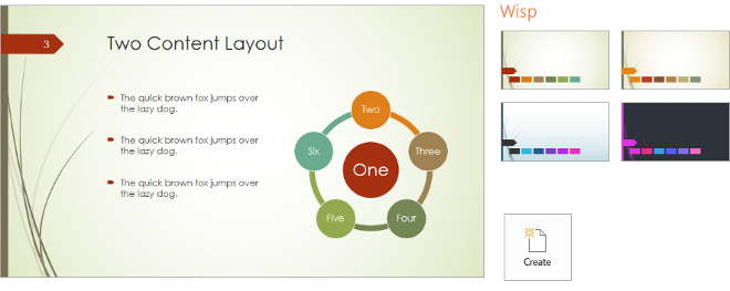
If you single-click on any of our new designs, you’ll see something new – a preview of the theme, along with a number of variations on that theme’s style and color. Here’s an example of the “Wisp” theme family, which has four color variants:
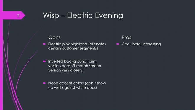
When we started developing our content strategy three years ago, our designers would send over tons of amazing options for each theme, and we found it extremely difficult to choose just one color palette from the set. We would end up choosing the “safest” option, the one that would cover the broadest set of scenarios and customers, but at the same time would target none of them. For example, if we had to choose only one option, we would never have shipped this inverted variant with bright pink highlights:
A great design can be polarizing, which is why in the past we would have avoided this one. Some people would love it, while others would hate it. Or in this case, most people would likely want something more toned down and less pink. However, because we now have theme families, we can cater to individual design preferences without alienating segments of our customer base. We end up with a lot of designs that people love, instead of a few designs that people think are just okay, and in the end that’s going to make a lot of people happy because it’s your presentation and your choice, not ours.
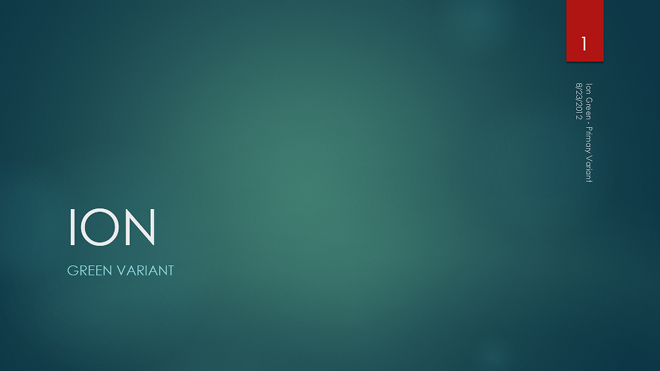
Let’s take a look at another theme called “ION” – here’s the “safe” variant:
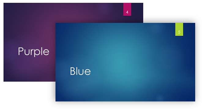
Green is a neutral color, and it plays well on most projectors and screens. Also, the color palette works well on colorful presentations and on blank white documents (like Word documents and Excel spreadsheets). In earlier releases of PowerPoint we would have stopped right there, but in this new version, we get to ship some excellent alternatives – while they might not apply as quite as well to all imaginable situations, they are simply awesome for certain ones. These two, for example, happen to be my personal favorites from the ION theme family:
The Power of Theme Families
It was always possible to change the color palette, font scheme, and shape effect styles of themes in PowerPoint 2007 and 2010, so what’s really new about the variants in 2013 theme families? First, let me highlight the problems we faced with our old model:
-
- There were too many unorganized stylistic pivots, and not all of the options looked good when applied to every theme. It’s nearly impossible to design a theme that looks good with every color palette combination from every other theme. Some combinations look good, but not all of them look great. Any options we surface at the top level need to look great, otherwise we’re wasting your time.
- The pivot controls, while powerful, weren’t very popular. We found that while ~40% of customers click on the design tab, a small fraction of those users ever click on these fine-grained controls, and many of those clicks were strictly exploratory. Furthermore, very few customers created their own custom palettes, font schemes, or shape styles, which means that our defaults have to be good because that’s all that most people will see.
- There wasn’t enough power. Some of our beautiful new themes have fairly intricate details. To keep them fresh and customizable, we often need to swap out more than just colors, fonts, or effects – tiny details that are specific to each theme and each variant. We needed a way to encode all of this information.
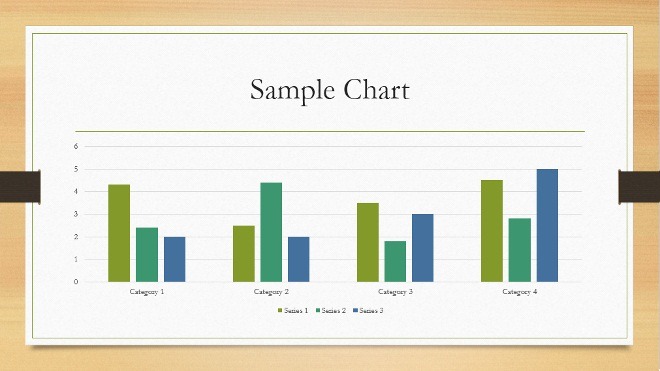
We designed theme families so that variants have complete control over all elements of the presentation’s design – colors, fonts, effects, layouts, text properties, paragraph properties, design elements, and photos and textures. Take a look at Organic, for example:
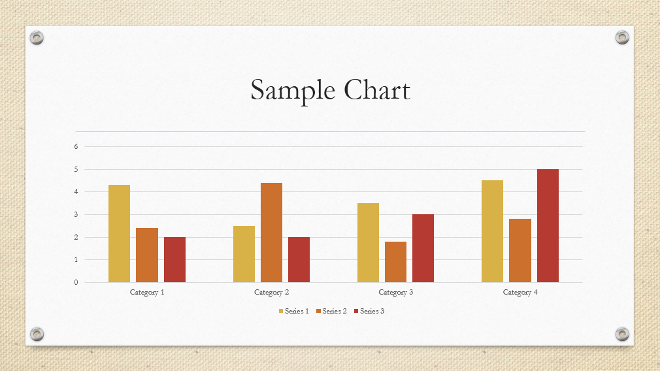
If you change from the Bamboo variant to the Sisal variant, we can swap out the band holding down the paper for rivets, change the color palette and color mappings, and we can replace the background texture entirely, and all you have to do is click once:
If you want to switch designs after you’ve already started to build your presentation, simply navigate to the Design tab in PowerPoint, where you’ll find a gallery of Themes right next to a gallery of Variants:
Use Theme Families to Tell Your Story
Every theme in the new PowerPoint is really a collection of designs, and we’ve built those collections in such a way that they can co-exist in the same presentation. Over the last couple years we’ve found that there is a lot you can say with a simple color change.
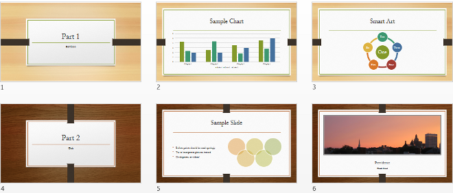
Whenever we change topics or switch presenters, change the variant color as a way of signifying the switch. It helps the audience remember which section contains what content. To apply a variant to a specific set of slides, select the slides, and then right click a theme icon in one of the galleries. Choose “Apply to Selected Slides”:
Now two parts of your document can have distinct visual style without deviating from a general aesthetic style:
Advanced Controls
We didn’t leave out advanced users when designing this feature. All of our themes are designed with customization in mind. All the shapes are accessible via the slide master, and all of the theme elements respond to color palette changes where possible (some of the rendered textures, like those in Organic do not). The color/font/shape style controls are available on the slide master, as well as in the Quick Access Toolbar. In the release version, we’ve added these controls to the variant drop-down gallery for easy access on the slide level:
Keeping it Fresh
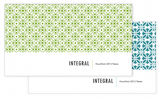
We’ve spent a lot of time analyzing presentations and popular designs in an effort to provide a set of themes that cover a broad range of tastes and needs. Some themes are timeless, and others come in and out of style. One of the coolest things about the new start screen and the improved design tab is that they are both dynamic – meaning we can update them after we ship the product. We’ve already got a lot of great new themes lined up for you, and we’ll continue to build more. In some cases we’ll even add bonus variants to themes that are very popular. Check out these new variants of the Integral theme family we have coming your way in the release version of the new PowerPoint:
You have a chance to help steer us in your favorite direction. How? First, we’ll pay close attention to the usage numbers on each of these themes. Second, we read every comment you post to this blog. So please, let us know what you like the most!
-Christopher Maloney

