
Microsoft 365 Blog
Skip featured posts


9 min read
Microsoft 365 Copilot Wave 2: Pages, Python in Excel, and agents
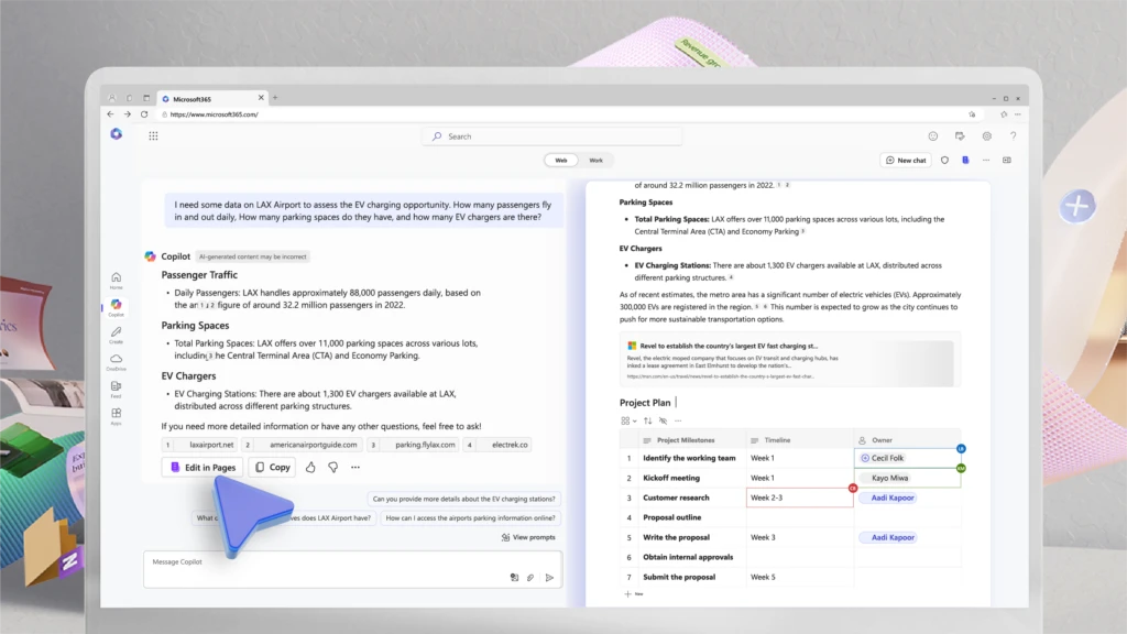
We are introducing Wave 2 of Microsoft 365 Copilot innovation, with three key updates. From enterprises to small businesses, they help Copilot get better every day. Nearly 1,000 customers have given us direct feedback on Copilot, and we’ve made more than 700 product updates based on that feedback.
3 min read
New agent capabilities in Microsoft Copilot unlock business value
Microsoft Copilot is already helping individual employees boost productivity, creativity and time savings. With the announcements at Microsoft Build 2024, we’re delivering an entirely new set of capabilities that unlock Copilot’s ability to drive bottom-line business results for every organization.
5 min read
Microsoft and LinkedIn release the 2024 Work Trend Index on the state of AI at work
For our fourth annual Work Trend Index, out today, we partnered with LinkedIn for the first time on a joint report so we could provide a comprehensive view of how AI is not only reshaping work, but the labor market more broadly.
4 min read
Bringing Copilot to more customers worldwide—across life and work
Continuing our vision for Microsoft Copilot to bring the power of generative AI to everyone across work and life, we’re expanding availability and purchase options for individuals and organizations and bringing new value to Copilot Pro subscribers.
6 min read
Introducing Microsoft Copilot for Finance: Transform finance with next-generation AI in Microsoft 365
We’re announcing the public preview of Microsoft Copilot for Finance, a game-changer for finance professionals and the newest role-based extension of Microsoft Copilot. Microsoft Copilot for Finance is a momentous leap forward, specifically crafted to revolutionize the daily grind of well-known financial processes.
5 min read
Expanding Copilot for Microsoft 365 to businesses of all sizes
We are updating our Microsoft Copilot product line-up with a new Copilot Pro subscription for individuals; expanding Copilot for Microsoft 365 availability to small and medium-sized businesses; and announcing no seat minimum for commercial plans.
6 min read
Microsoft Copilot for Sales and Copilot for Service are now generally available
Microsoft is dedicated to helping organizations transform the way people work using secure, enterprise-grade AI capabilities, no matter which business applications teams depend on. Starting today, you can seamlessly integrate role-specific Copilot capabilities into Microsoft 365 applications and popular customer relationship management (CRM) and contact center systems for sales and customer service professionals.
10 min read
Introducing Microsoft Copilot Studio and new features in Copilot for Microsoft 365
At Microsoft Ignite 2023, we are announcing new innovations across Microsoft Copilot—one copilot experience that runs across all our surfaces, understanding your context on the web, on your PC, and at work to bring the right skills to you when you need them across work and life.
4 min read
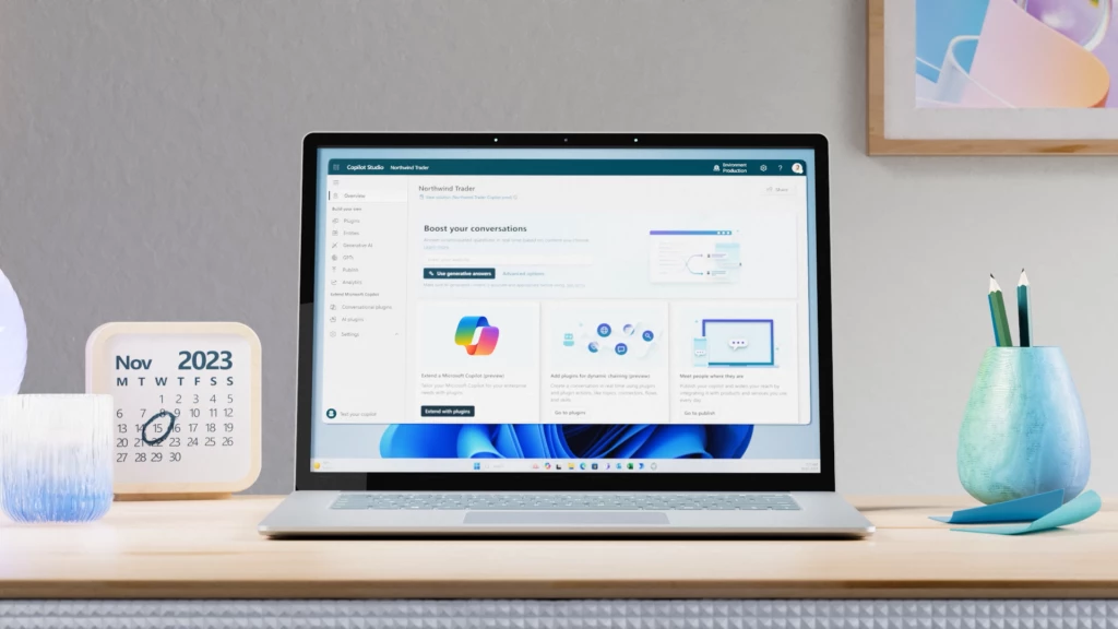
Announcing Microsoft Copilot Studio: Customize Copilot for Microsoft 365 and build your own standalone copilots
At Microsoft Ignite 2023, we’re excited to announce Microsoft Copilot Studio, a low-code tool to customize Microsoft Copilot for Microsoft 365 and build standalone copilots.